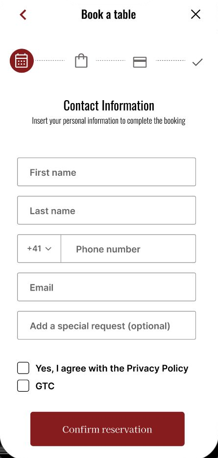
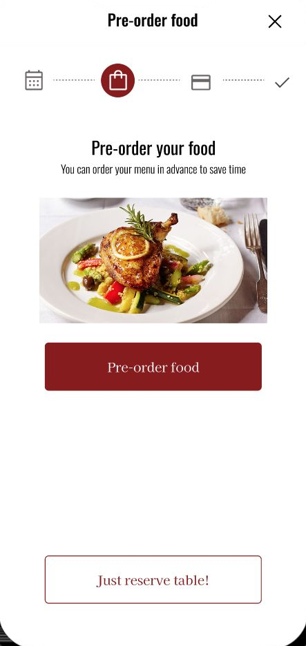
A menu and payment app for a high-end French restaurant that lets guests browse the menu, reserve a table and pre-order their meal in advance, so they save time, keep their independence, and can simply enjoy the evening.
First UX project
La Lumière is a concept app designed for a high-end French restaurant. It lets guests look through the menu, book a table and pre-order their food in advance, so the moment they sit down, the experience is about the company and the meal, not the logistics.
The target users are middle-aged and older, high-earning and well-educated people who are short on time. Many of them also experience age-related limitations such as hearing loss, which makes ordering in a loud, hectic restaurant stressful and dependent on help from others.
A set requirement of the brief was that the app had to include a group of people with impairments, so accessibility was a constraint from the very start, not something added at the end.
Over five months I led the project end to end (user research, wireframing, prototyping, interaction and visual design, UX writing, and two rounds of usability testing), taking the concept from problem framing to a high-fidelity, accessible prototype.
The result is an app that preserves the comfort and atmosphere of a luxury dining experience while quietly removing its friction: no phone call to reserve, no waiting for the menu, and no pressure to decide on the spot.
Career-driven people have less time to spend waiting in a restaurant for their food. On top of that, with increasing age many guests rely more on help from others: hearing impairments, made worse by loud and hectic environments, turn a simple order into a stressful exchange.
Let users order their food in advance, at their own pace, saving time and ensuring their independence even with age-related limitations. The visit becomes about enjoyment, not navigating a process that works against them.
Over five months I owned La Lumière from problem framing to a high-fidelity, accessible prototype: research, design and two rounds of usability testing.
I worked mainly in Figma, from wireframes to the high-fidelity prototype, with a few supporting tools for research, content and visuals along the way.
During user research, two groups stood out. The first were around sixty years old: well-educated, established in leadership roles, and high-earning. The second were in their late thirties, building their careers, earning well, and frequently holding business lunches at expensive restaurants.
Because there are demographically more older people, and because wealth, and therefore high-end restaurant visits, tends to increase with age, I chose to focus on the first group. They also surfaced the most acute, under-served needs: time pressure compounded by age-related hearing loss.
Finding direct competitors was hard: almost no high-end restaurant offered a menu-and-payment app, so beyond one close match, Tao Downtown, I deliberately added two larger indirect players, Domino's and McDonald's. They don't compete in fine dining, but their ordering and payment flows are mature and widely used, which made them useful references for how to present a menu, handle checkout and approach accessibility. I compared all three across first impressions, interaction, visual design and content.
Accessibility was the weakest area for every competitor: tiny fonts, no screen-reader support and limited languages, exactly the friction my older, hearing-impaired users feel most. Not one offered a calm way to browse and pre-order before arriving at a fine-dining table.
That gap, together with how much a strong visual identity and appealing food photography helped the best performers, pointed La Lumière's direction: legible and accessible, with a confident look and an order-ahead flow that removes pressure rather than adding it.
Alice is an older editor of a food magazine who needs an app for a restaurant where she can look through the menu and order her food in advance, because she feels rushed to make a quick decision and has trouble hearing the waiters.

"I want to maintain my independence and be able to focus only on the people and things I love."
Alice is a 60-year-old food-magazine editor living alone in New Jersey. Since the sudden death of her husband, she spends her weekends with her niece, with whom she shares a love of food. Over the past year her hearing has worsened, making it hard to understand the waiter, and as a fiercely independent person, she's uncomfortable relying on help. She wishes she could browse the menu and order in an app before arriving, so that once she's at the restaurant the food simply comes and she can enjoy the meal without communication troubles.
I designed the app around Alice, but a second persona, James, shows a younger guest it could serve just as well: an ambitious lawyer who wants to pre-order and pick up his meal without losing his whole lunch break.

"I want to exclusively focus on my career, while not lowering my standard of living in the meantime."
James is a 38-year-old ambitious attorney at a major law firm in Philadelphia. He has worked there for eight years and is on the brink of making partner. With another colleague in the running, he often uses his lunchtime to prepare for upcoming meetings, so instead of joining coworkers at the expensive restaurant next door he picks up food from a nearby eatery and eats at his office. It costs him a lot of time, which frustrates him, yet the small fast-food joints aren't an option for him either.
Alice's goal is to spend a nice evening at the restaurant without having to rely on anyone for help during the ordering process. Mapping her current visit revealed emotional ups and downs, from finding the restaurant's number and the difficult phone reservation, to the long wait and the pressure to choose quickly.
| Stage | Select restaurant & reserve | Go to the restaurant | Order the food | Eat | Pay |
|---|---|---|---|---|---|
| Tasks |
|
|
|
|
|
| Emotions | Overwhelmed finding the number; worried about calling because she struggles to understand the waiter. | Excited for the restaurant visit. | Stressed by the pressure to choose; frustrated she can't understand the waiter acoustically. | Excited about her food; annoyed by the long wait; happy when it arrives. | Annoyed at waiting again for the bill; stressed by the waiter standing impatiently beside her. |
| Opportunities |
|
|
|
|
|
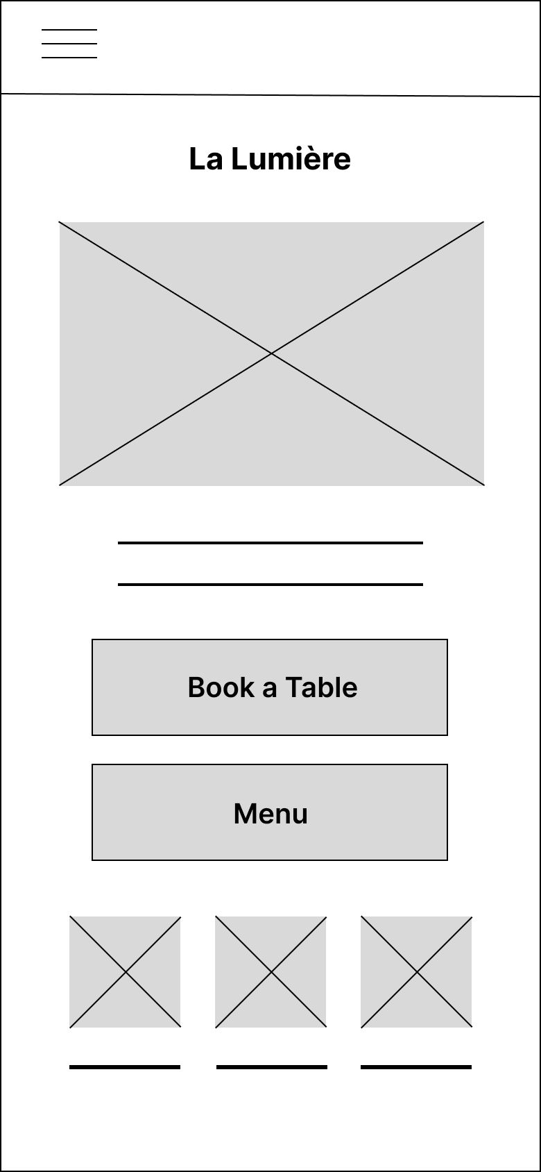
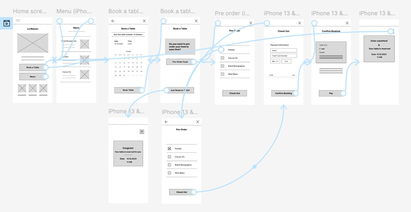
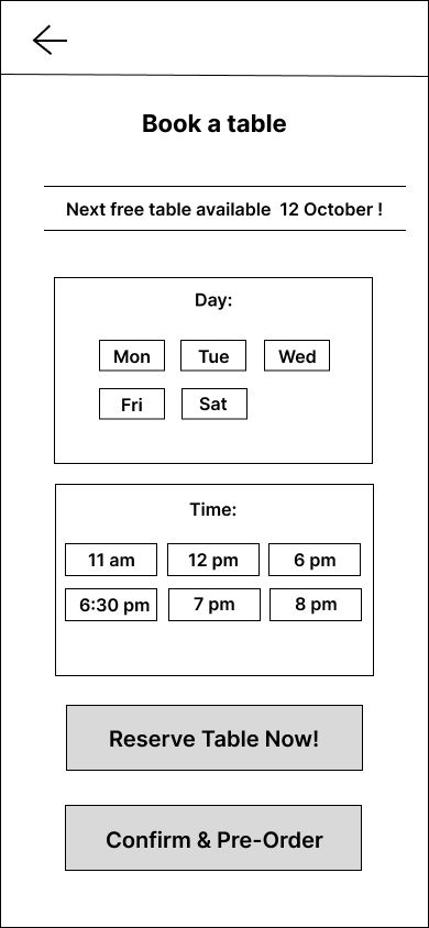
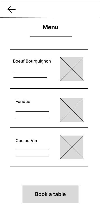
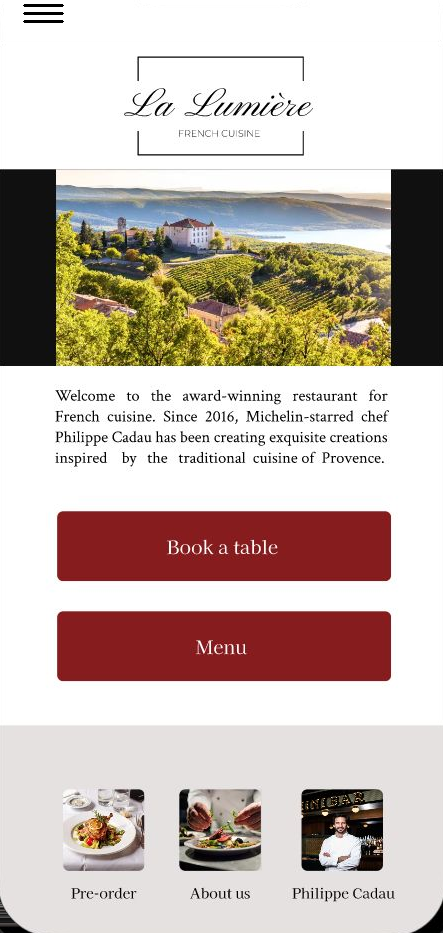
Everything centres on the home screen, where the two primary actions, Book a Table and Menu, sit side by side. From booking, the guest moves through a single guided flow that folds the pre-order and payment into the reservation itself.
I aimed to keep the flow simple and intuitive, even for first-time pre-order users, since most people have never ordered their restaurant meal in advance before.
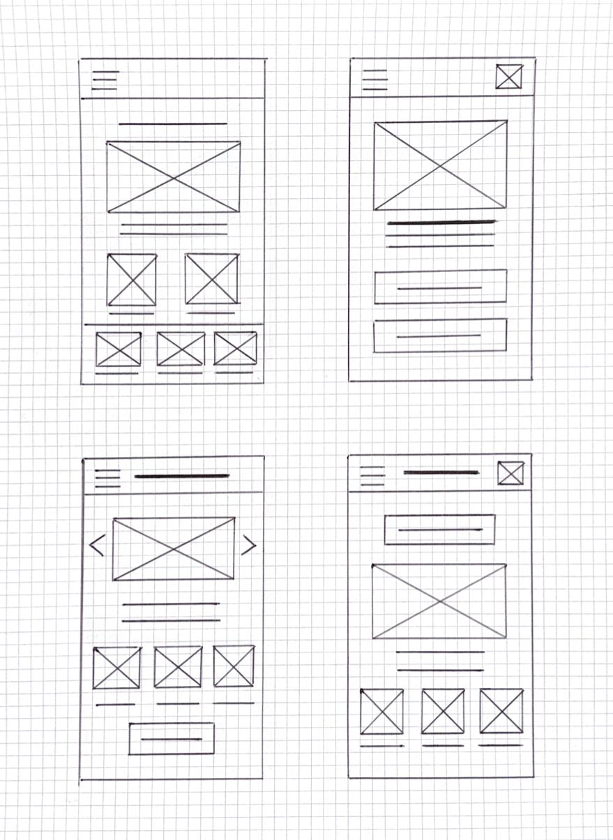
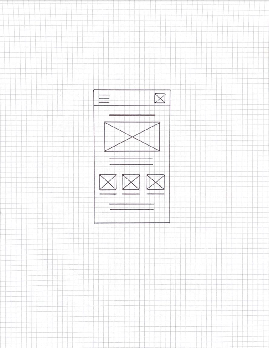
My goal was a minimalist yet elegant design that focuses only on the essentials, easy to use for target users who are around sixty and not digital natives. I sketched several versions of the same screen, then drew a refined version pulling together the strongest ideas.
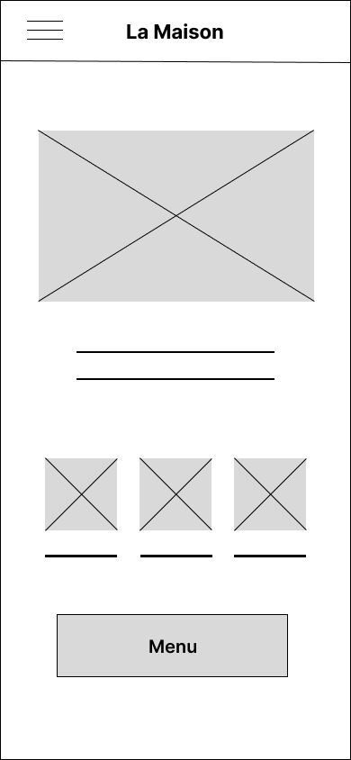
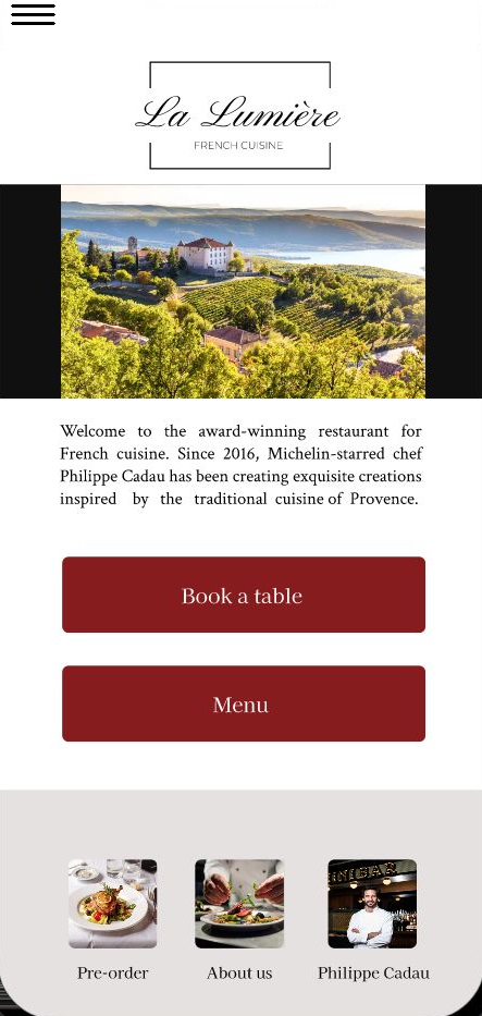
The first digital version was clean and elegant with only the necessary elements: a menu button, a photo of Provence, the restaurant name, a short intro and three blog posts. After the first usability study I renamed it “La Lumière”, added a clear Book a Table button beside Menu, and wrote a blog post explaining the pre-order process, since so few users had done it before.
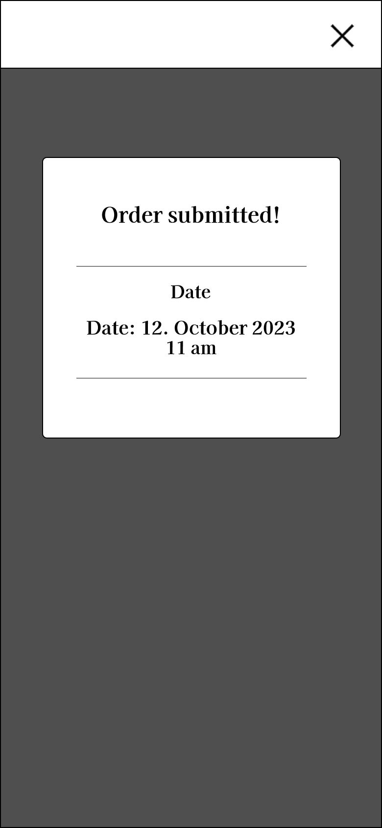
I built a low-fidelity prototype to test the core flow end to end: homepage → menu → book a table → choose date and time → pre-order food → enter card details → review summary → pay → confirmation. After two rounds of testing, I rebuilt it as a high-fidelity prototype with the full visual design and real content.
View prototype on Figma →
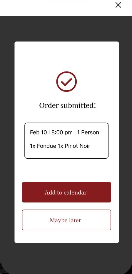
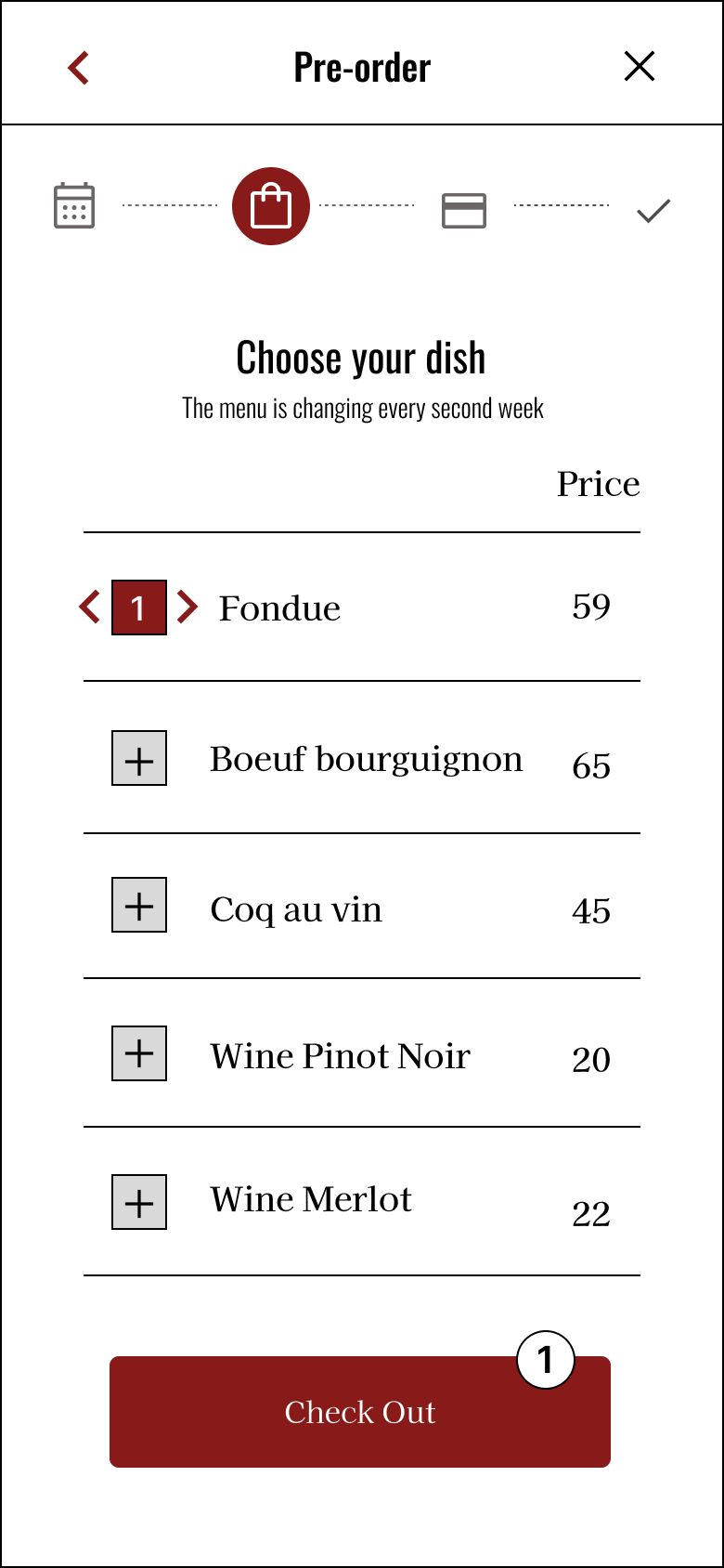
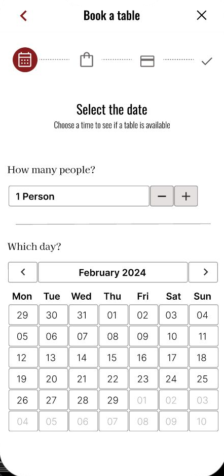
The same flow, fully designed and interactive: guests move from the home screen through date selection and pre-order to a clear, reassuring confirmation.


Before testing, I wrote a study plan to keep the sessions focused. The goals: find out whether people understand how to pre-order, whether the app is difficult to use, whether hearing-impaired guests need assistive support, and whether there's real demand for pre-ordering in high-end dining.
The tasks I asked participants to complete:
Afterwards, each participant completed the System Usability Scale, rating ten statements (such as “I think the app is easy to use” and “The main user flow is clear”) from strongly disagree to strongly agree.
I ran unmoderated usability studies with five participants (two men, three women), asking them to complete tasks in the prototype. The first round tested the low-fidelity flow; the second tested the refined mockups after the initial changes were made.
Each finding came from watching multiple participants hesitate at the same point for the same reason, which made the necessary changes unambiguous. The biggest themes were date clarity, the discoverability of booking, and reassurance at the moment of decision and confirmation.
"I'd actually use this. I never knew you could order before you even arrive."After the sessions I put every observation and quote on a virtual sticky-note board and grouped them into themes. The clusters that came up again and again became the findings I acted on.


The pattern across both rounds was consistent: the flow worked, but users hesitated wherever the app asked them to commit without enough context. Every iteration aimed to replace that hesitation with confidence: surfacing the primary action, clarifying dates, and adding reassurance at the points of decision and confirmation.
Because pre-ordering is unfamiliar to most people, much of the work was about gently teaching the concept as users moved through it (with a dedicated blog post, dish photos, and a clear summary step) rather than assuming they already understood it.
The visual language is designed to feel like the restaurant itself: refined, warm and unhurried. A deep Bordeaux red anchors the key actions against a cream-and-white base, and an elegant serif gives the brand a sense of occasion without tipping into ornament.
Restraint was the point. For users who aren't digital natives, every screen shows only what's needed for the step they're on: generous spacing, large legible type, and one clear action at a time.
The brand wordmark, La Lumière, I designed specifically for the app: an elegant serif logotype that sets the tone the moment it opens. The same logo also features in my graphic-design work.

Accessibility wasn't a layer added at the end: it was the reason the app exists. Three considerations shaped the experience for users with hearing and vision limitations, and for those who aren't digital natives.
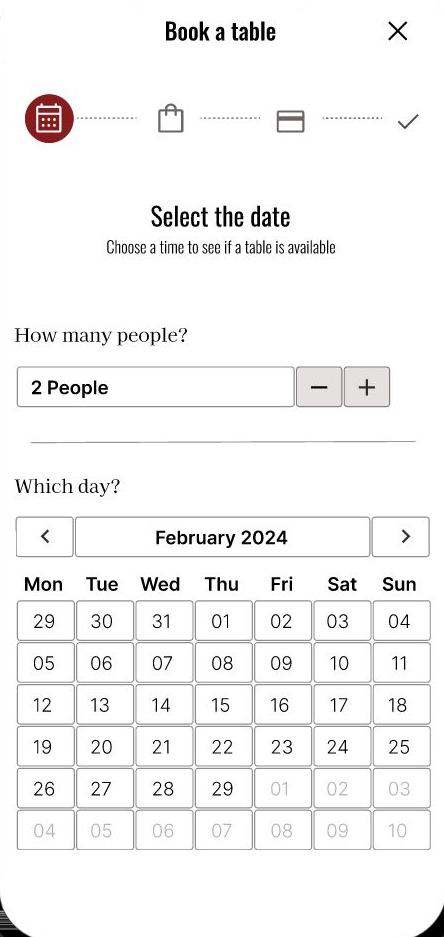
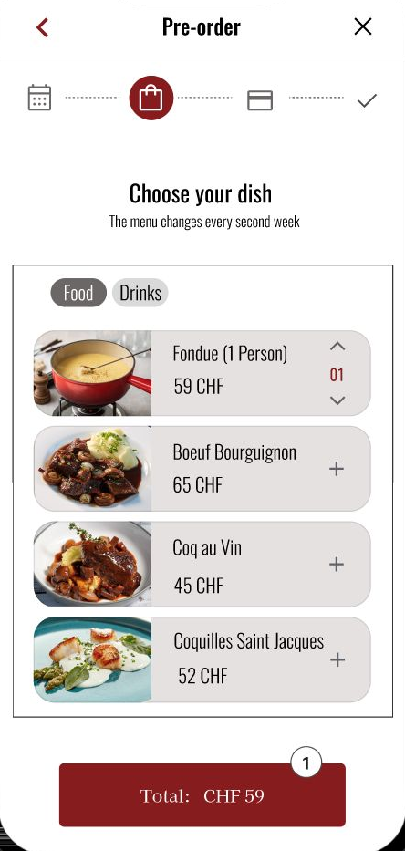
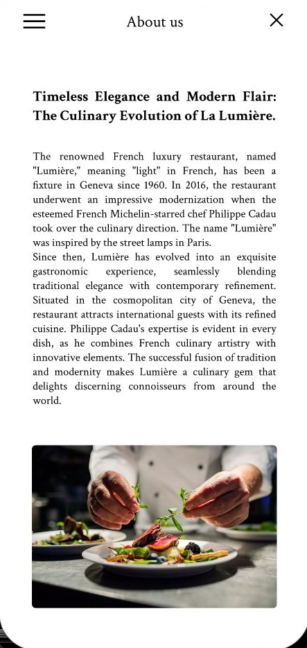
Four moments from the high-fidelity app (booking, story, details and pre-order), each kept to a single, confident task.


La Lumière changes the way we order at a restaurant without sacrificing the comfort and atmosphere of a luxurious dining experience. It lets guests conveniently pre-order their meals from home: no calling ahead, no long wait for food, and no pressure to decide on the spot.

Across this project, these were the activities I felt most confident in and enjoyed the most, the parts of the process where I could really push the work forward, from early research and structure to interaction, branding, writing and the moments of invention in between.