A complete redesign of the online shop for a young Swiss snack-box startup. The old site never fit their brand or reflected what the founders had imagined, so I reworked how it works as much as how it looks: a purchase journey that feels intuitive and effortless, and a brand that finally felt like them, shaped round after round by research, usability testing and real customer feedback.
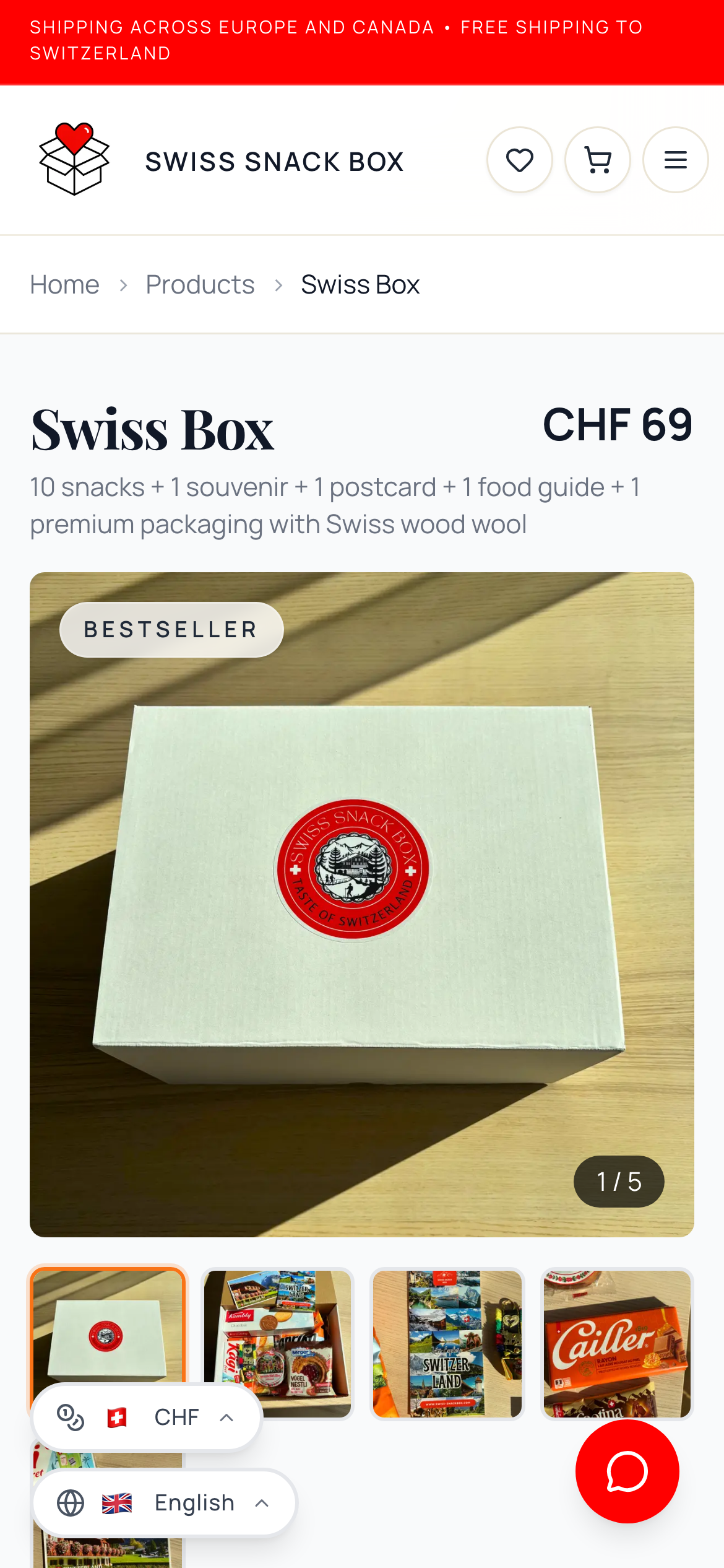
Swiss Snackbox is a small Swiss startup with a lovely, simple idea: two snack boxes with unique themes that can be sent anywhere. Their signature product, the Swiss Box, makes a perfect gift, but can just as easily be bought for yourself. Inside are ten Swiss snacks, a little food guide that introduces each one, a small souvenir, and a postcard with a handwritten message. It is sold alongside a themed Movie Night Box.
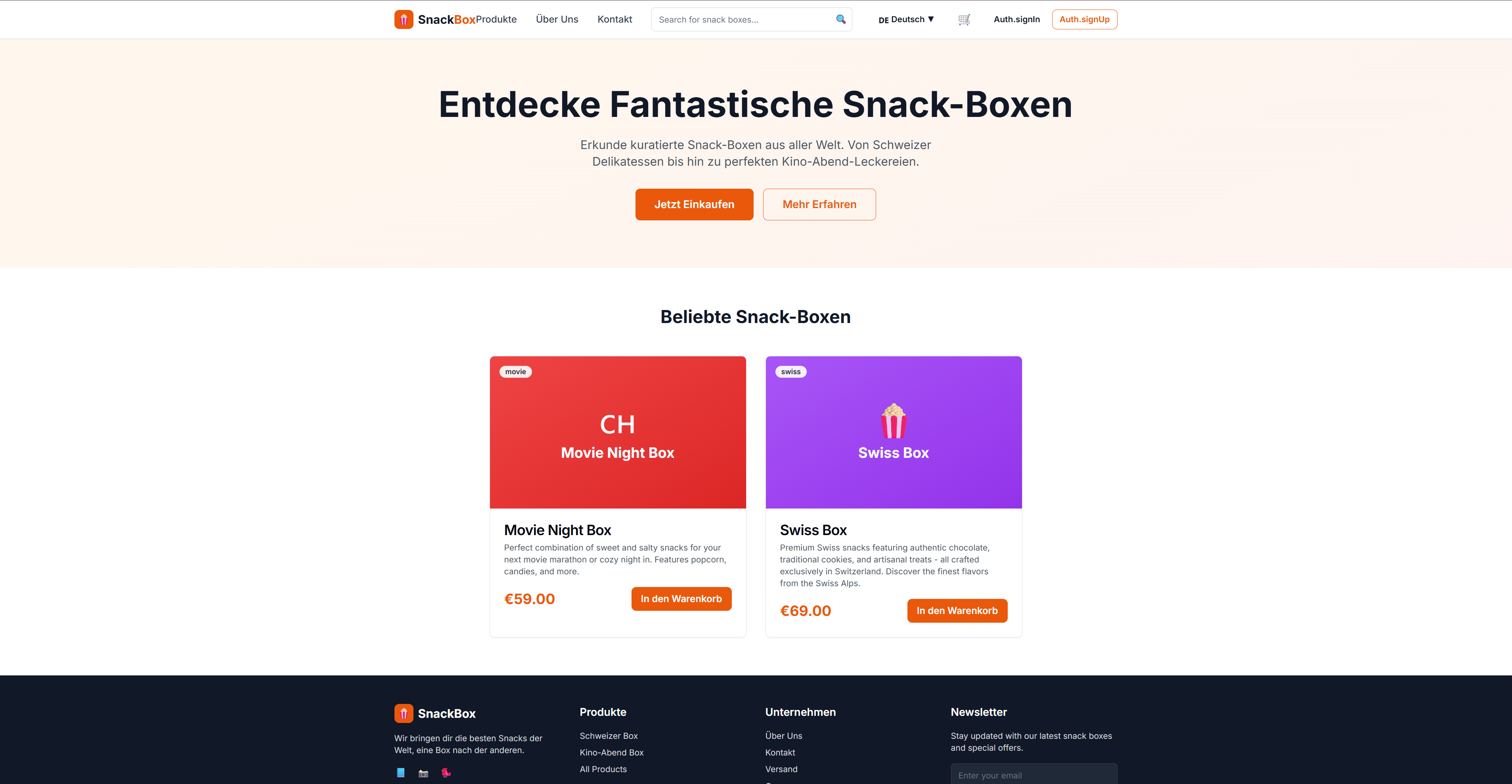
A developer had already built the shop, but the founders didn't see themselves in it. It didn't feel Swiss, it didn't feel premium, and it didn't feel trustworthy enough to carry a premium gift you'd send to someone you love.
I came in to lead the redesign. I ran a competitive analysis and a UX audit of the existing shop, carried out user research and customer surveys, and went through round after round of usability testing to find and smooth every point where the path to purchase broke down. Alongside this, working with the developer across several phases, I shaped the brand identity, the logo and the visual design that fit the company, shot and edited the product photography, and wrote much of the customer-facing copy.
The work carried on well past launch. Guided mainly by Vercel's analytics, the visitor numbers, the mobile-versus-desktop split, the drop-off rate and where buyers came from, alongside the Google Ads data and what customers kept asking for, I built the requested features myself and developed the full mobile version once the first sales were in. I tested the payment flow closely before those first orders and kept testing afterwards, so nothing broke on the way through Stripe to checkout. The result is a shop that looks and sounds like Swiss Snackbox, wins its first customers, and knows exactly where it is headed next.

The founders had everything that mattered, including the product, the suppliers and the story, but they had a website that told none of it. Built from a generic template, it didn't look Swiss or premium, the path to payment was confusing and often broke down, leading people to abandon their purchase, and, with customers across the EU, it locked out anyone who didn't speak English or German. Before the redesign there were no sales and barely a single newsletter signup.
Rebuild the store so it looks unmistakably Swiss and premium, makes the path to payment effortless and reliable, and welcomes customers across the EU in their own language, turning a stalled shop into one that converts and grows its newsletter audience.
I owned the UX, shaped the UI, brand identity and logo, shot the product photography and wrote much of the copy. The site's framework was already in place, so rather than wireframe from scratch I worked from a design concept: the developer built the first version, and I refined it page by page through annotated screenshots. I tested the site thoroughly, both before the first orders came in and long after, above all the Stripe payment flow, to make sure checkout worked reliably from start to finish. From there I went further and developed the requested features and the full mobile version myself, in code, always guided by what I uncovered in the customer surveys and usability studies I ran.
A deliberately lean toolkit. I designed the brand, the logo, the visuals and all the image editing in Canva, and I developed the features and the full mobile version myself in Visual Studio Code, with Claude as an AI pair, working hands-on with the shop's Supabase, Stripe, Resend and Vercel stack, and versioning my work with Git and GitHub. I also ran the shop's Google Ads and, above all, watched Vercel's analytics, the visitor numbers, device split, drop-off rate and countries, to guide what to build next.
The shop runs on Next.js, a React framework written in TypeScript, deployed on Vercel with Supabase as its backend. A developer built the core platform and foundation, while I contributed selected features, much of the mobile experience and the UI and UX decisions; the stack below therefore reflects a collaborative build rather than individual authorship.
Supabase provides the Postgres database, the authentication and the file storage, with some logic written directly in the database in PLpgSQL. Stripe handles payments and checkout, the exact step where the old shop used to lose customers. Resend, paired with React Email, sends the transactional emails such as order confirmations. next-intl runs the shop in six languages, so the Spanish and Italian visitors the old shop turned away now have a store that speaks to them. Tailwind CSS handles the styling on top of accessible Radix UI components, security headers such as CSP and HSTS keep the shop hardened, and Vercel adds analytics and speed insights alongside hosting. The code is versioned with Git on GitHub.
I started with two questions: what makes a small Swiss brand feel trustworthy enough that someone would buy a premium snack box from a shop they had never heard of, and where exactly potential customers were leaving once they reached the online shop? The answers came from a mix of desk research, a competitive look at snack-box sellers in Switzerland and abroad, customer surveys, and the brand's own advertising analytics.
I also looked closely at what simply feels Swiss, from the colours and the materials to the sense of restraint, so that I could ground both the brand and the design. Alongside this, I ran a UX audit of the existing shop, evaluating it against established usability principles to map where the experience broke down, and complemented it with usability testing on real users to see exactly where a purchase quietly fell apart.
The data was very clear. Most people were shopping on their phones, where there was no real mobile experience. A sizeable number arrived from Spain and Italy and left again, because the shop spoke only English and German. The checkout asked for so much that many people gave up before paying. Each of these findings became something concrete to fix.
Claudia isn't shopping for herself. She is sending the Swiss Box to someone she cares about, perhaps for a birthday, a new baby, or a friend in recovery, and she wants it to feel personal. Like most customers, she has a connection to Switzerland and a reason to share a little of it.
"I want to send something that feels like home, and add a small message in my own words."
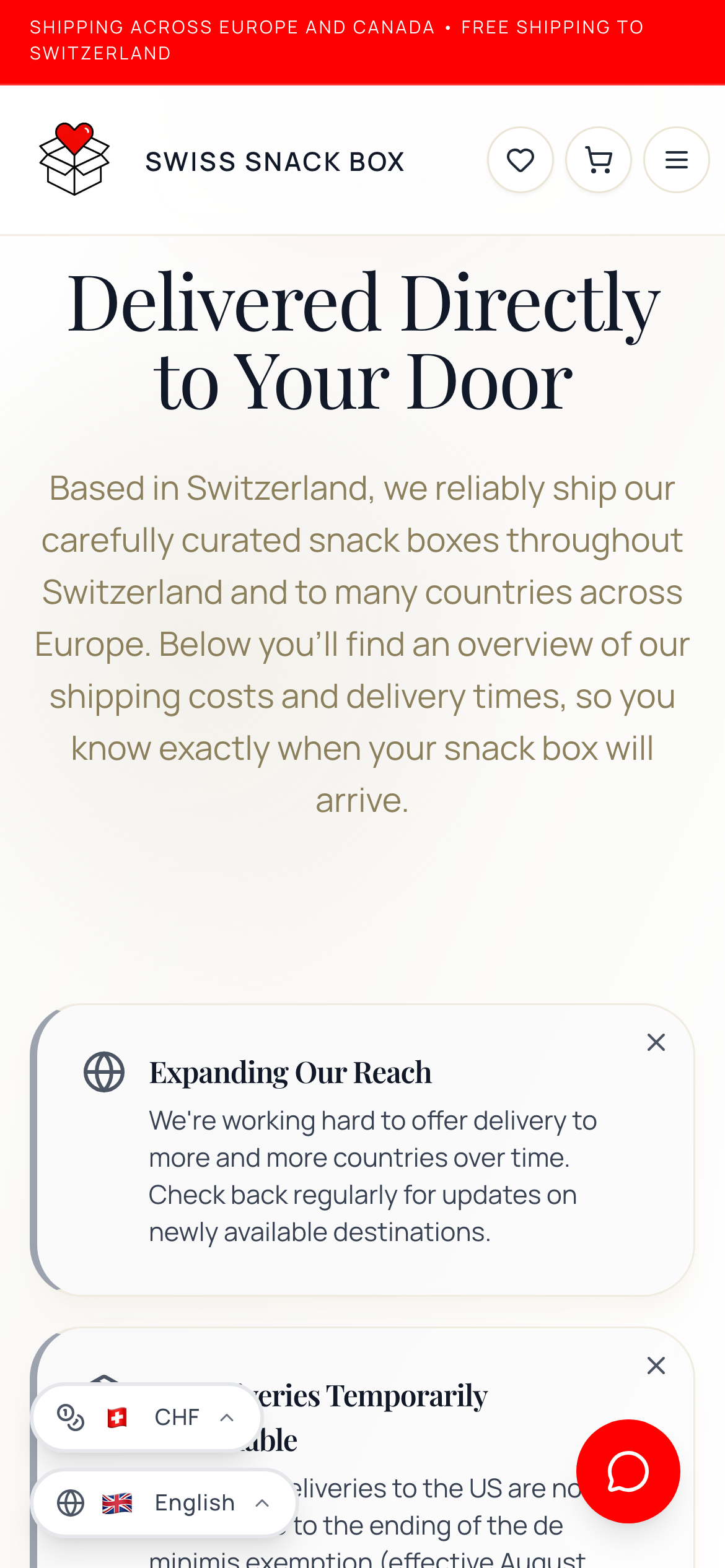
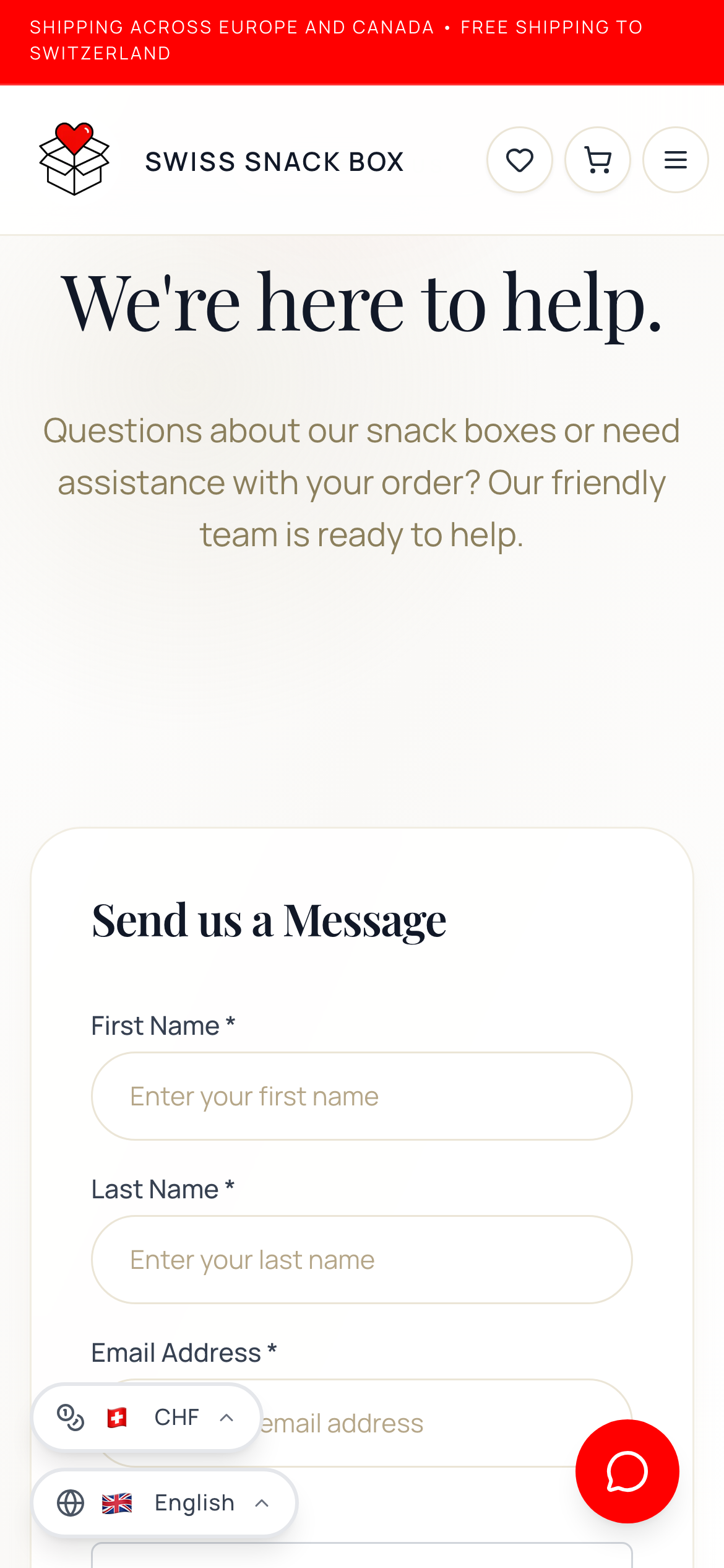
The site stays deliberately small. The homepage leads with the product, while two product pages and a handful of supporting pages, such as shipping, about and contact, give a first-time buyer everything they need to feel safe before they make their first purchase.
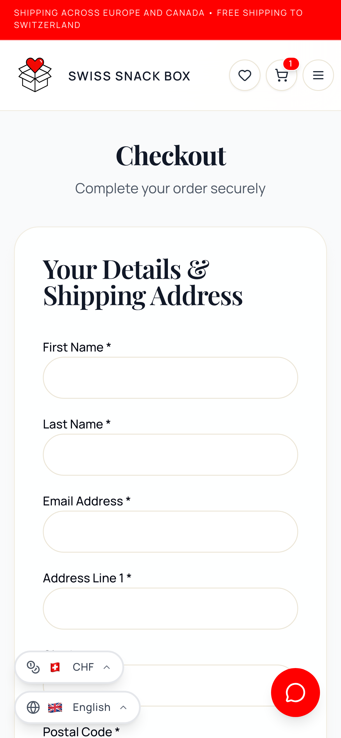
The purchase is the heart of the shop, and it is where most of my work lived. I took a little friction out of every step, and a lot of it out of payment, which was where people were slipping away.
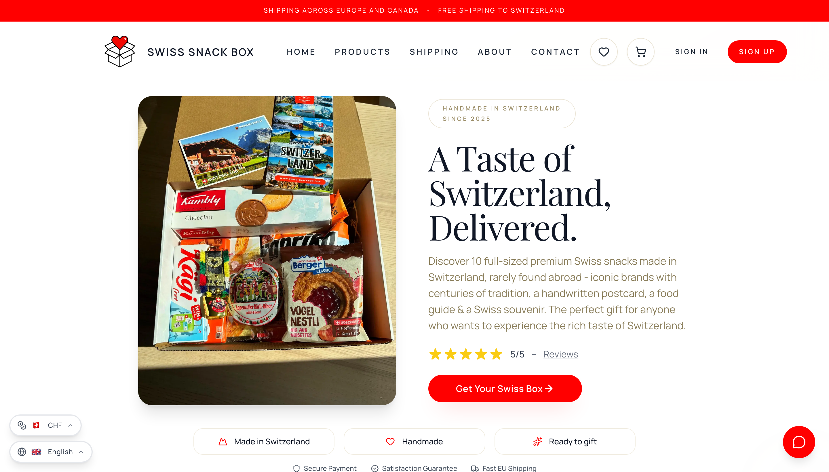
The old template had no real identity, so the redesign meant building the brand from the ground up. The previous site leaned playful, with loud colours, a clutter of icons and not a single real photo, which pulled against a premium gift made and packed by hand in Switzerland. I went for something simpler, more elegant and honest, that feels like Switzerland itself, clean and calm and quietly confident, while keeping a light, playful touch that suits a box of snacks, so people always know where they are.
We settled on a white background with red accents, representing the colours of the Swiss flag. Red sets the tone, so a single glance brings Switzerland to mind, while the white background keeps everything calm so the product photography draws the most attention. Black adds sharp contrast and quietly recalls the traditional Swiss art of Scherenschnitt (paper-cutting). Grey represents the Swiss mountains and the warm brown tones the Swiss forests. Inside the Swiss Box, wood wool is used to protect the snacks, so these natural, earthy tones fit the brand perfectly. I wrote much of the copy alongside the layout, warm and specific, and added four more languages so customers across Europe could finally browse and shop in their own language.


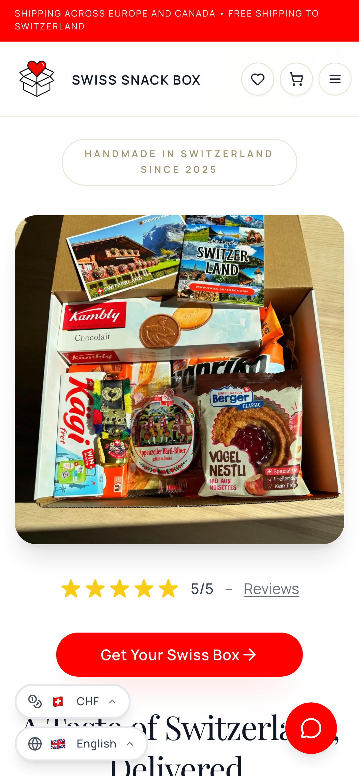
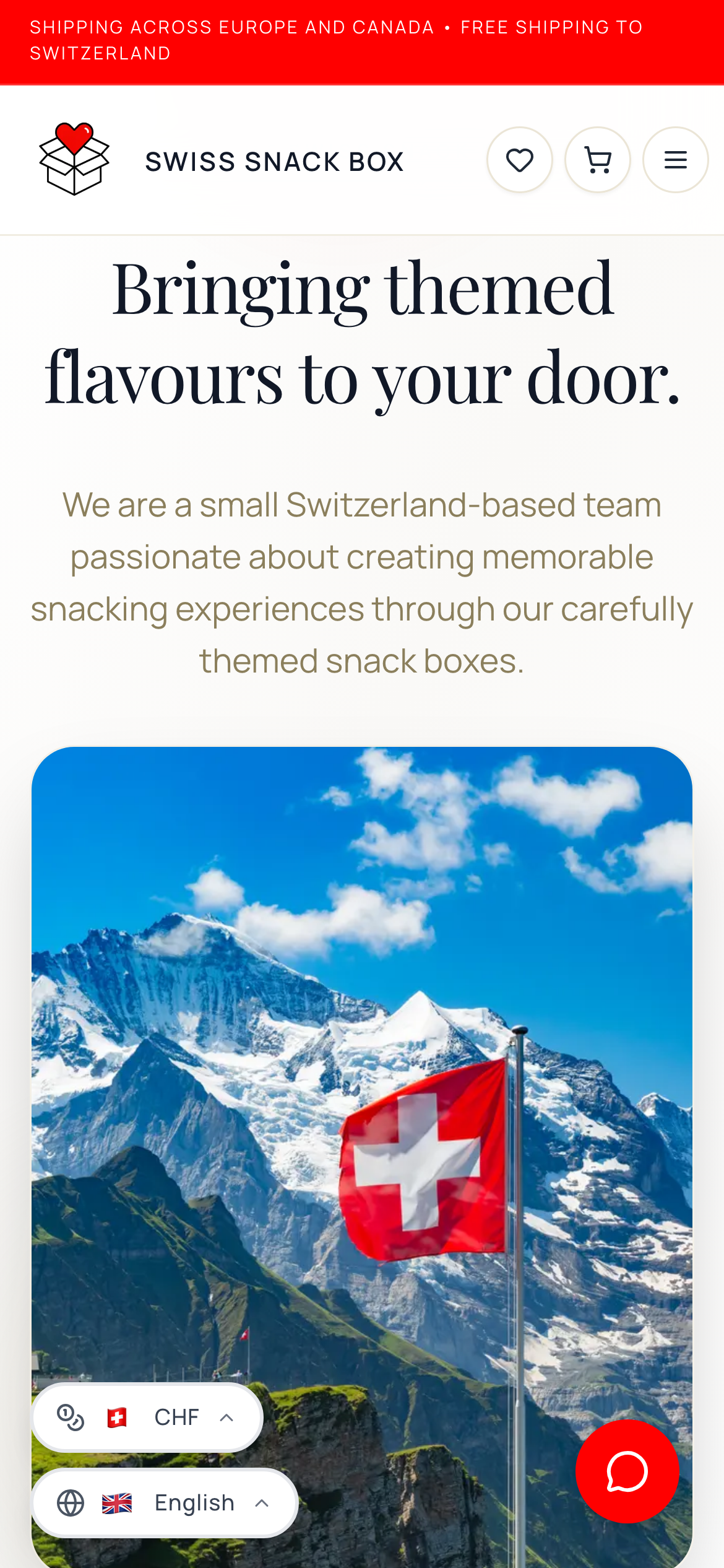
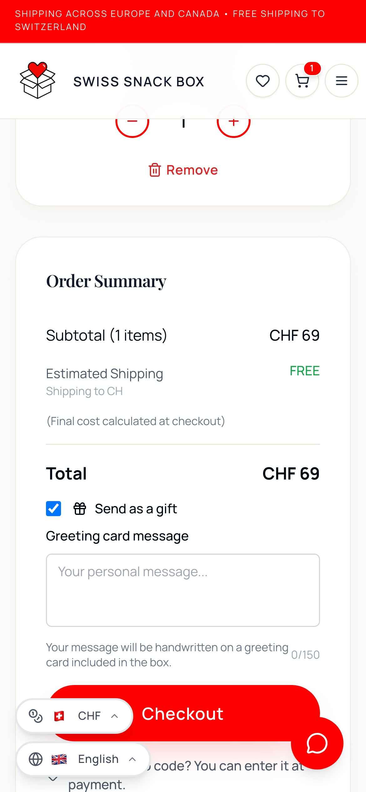
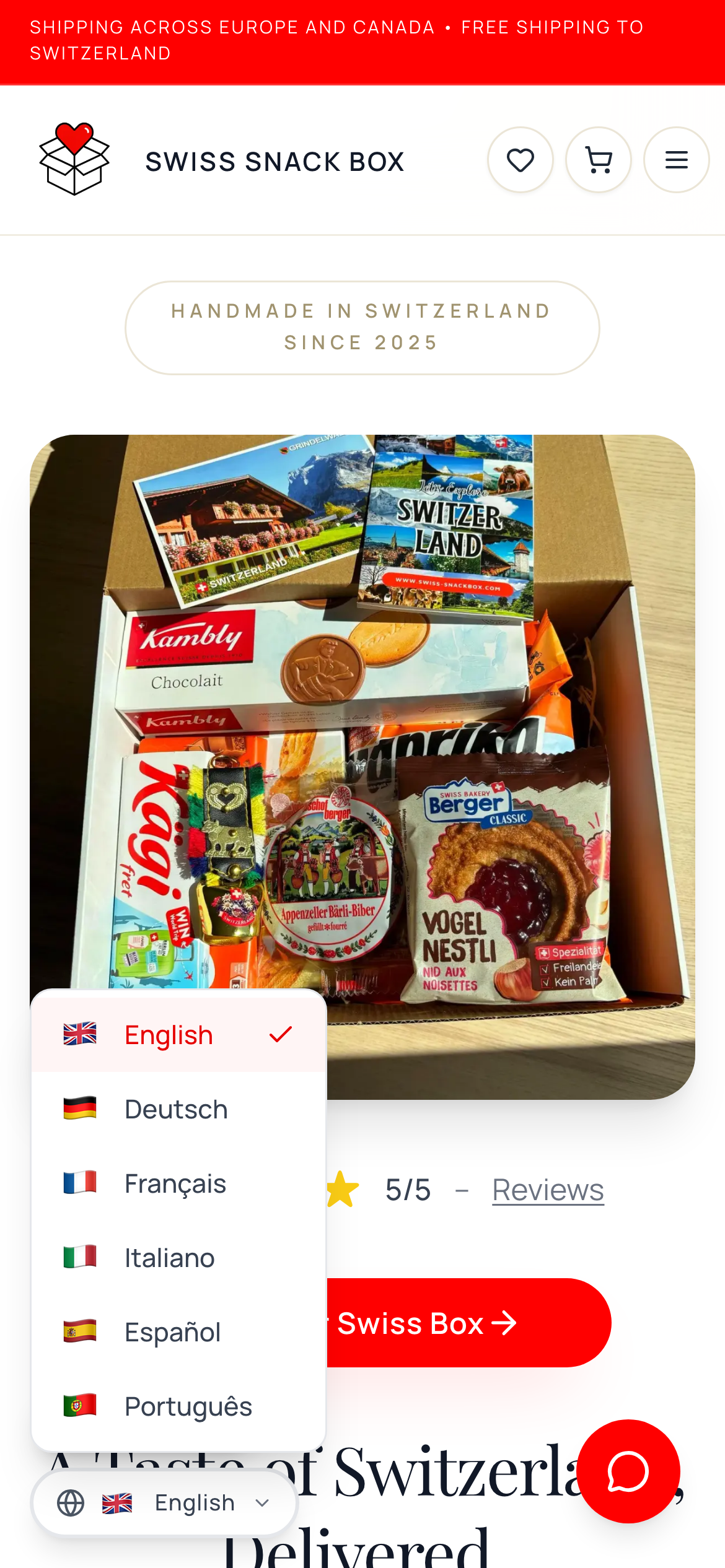
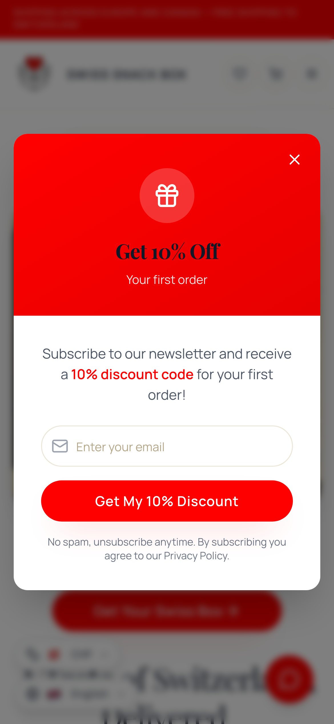
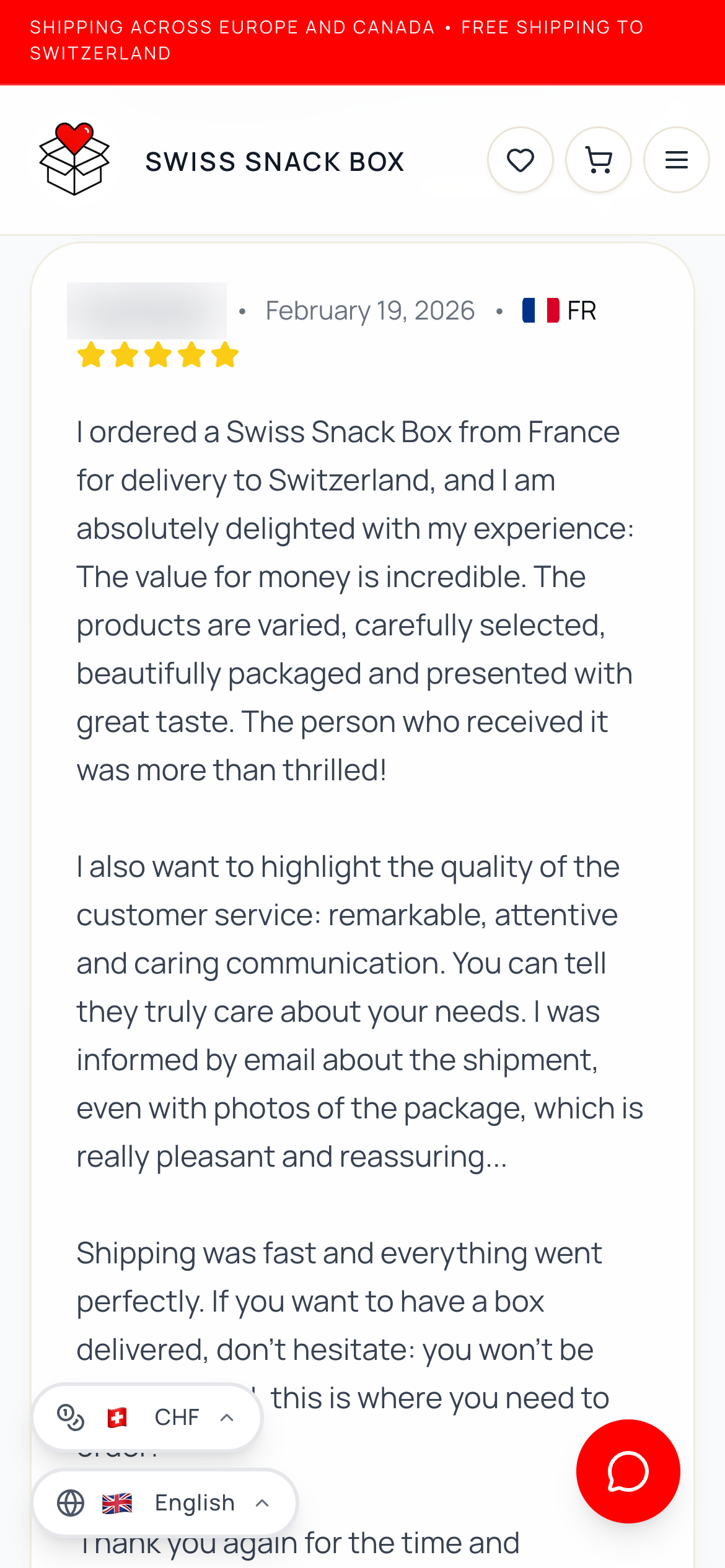
The important pages of the live shop, shown on mobile, where most visitors are. Swipe through the homepage, product, shipping, about, contact and checkout.
Testing never really stopped. Before launch I ran a UX audit and a usability study with test users, focused above all on the core journey, the path to payment, refining it round by round until the whole flow ran smoothly. After launch, every problem the data or a survey surfaced started another round.
Two rounds stand out. The first, around the soft launch, turned up three things standing between people and a purchase: gifting, language and a heavy checkout. The second, once sales were steady, came straight from the analytics. Almost everyone was on a phone the shop wasn't really built for, and hesitant visitors needed more reassurance before they would buy.
Recruiting from real and would-be customers, people who actually send Swiss gifts, kept the feedback specific. It was about trust, language and checkout, rather than e-commerce in the abstract.
"I just wanted to send a box with my own note, and now I can do it without emailing anyone."Every change traced back to a specific moment where the shop let someone down, whether in a test, a survey or the analytics, and never to guesswork.
The biggest shift came from the customers themselves. The founders had imagined the postcard inside each box as their own gesture, a handwritten thank-you to the buyer, because they assumed most people were keeping the box for themselves. The survey said otherwise. Most people were buying it as a gift, and they wanted their own words on that postcard rather than the makers'. So the concept changed, and I built a gift option where the buyer chooses to send the box as a gift and writes the message personally.
The analytics pointed to another fix. A steady stream of visitors arrived from Spain and Italy and left without buying, because the shop was only in English and German, so I added French, Italian, Spanish and Portuguese, and the drop-offs fell sharply. It fits Switzerland itself: large Italian- and Spanish-speaking communities, many descended from the guest workers who came and put down roots here, make up a significant part of the population, and they often have family in and beyond the country to send a Swiss gift to.
The second round was about the phone. Because most visitors were shopping on mobile while the design had been built for desktop first, I rebuilt the mobile shop to feel effortless, with the product and a buy button right in the hero and no long scroll. Around the same time I lifted the newsletter out of the footer and into a popup, and added reviews and testimonials to give hesitant visitors the reassurance they were missing.
The features and improvements I added to the existing shop, shaped round by round from research and real customer feedback, are all live in the shop today.
The soft launch landed well, and the feedback has been nothing but positive. The next chapter is mainly about building trust: being seen by new customers and giving them reasons to believe in a young brand, while turning those satisfied early buyers into repeat customers.
For a young shop with almost no budget, the redesign turned a site with no sales into one that quietly converts and steadily grows in its first months since launch, and it handed the founders a brand they are proud to put in front of people.