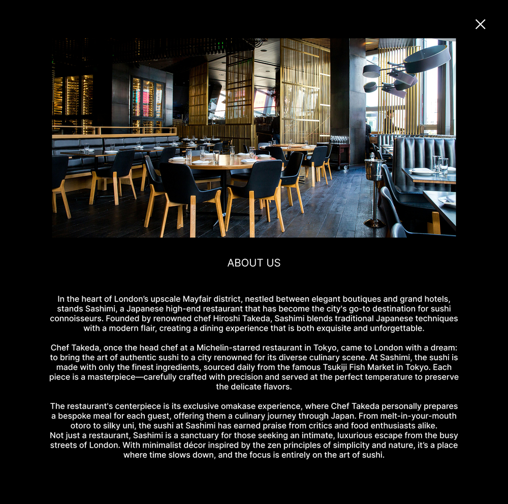
A responsive app for a high-end sushi restaurant, with a rich, luxurious interface with beautiful imagery, appetising and effortless to read, that holds its elegance across mobile, tablet and desktop.

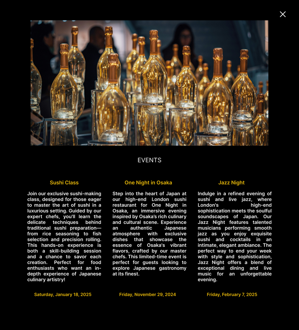
Sashimi is a high-end Japanese sushi restaurant in London's Mayfair, where Asian heritage meets modern luxury. The app brings that experience online: browse the menu, book a table, pre-order the meal, and discover signature events like One Night in Osaka, a sushi class or jazz night.
This was a focused UI/UX design project, running from the information architecture and wireframes through to the final visual design. There was no separate usability study with users; the work was about getting the structure and the interface right: translating the restaurant's premium, understated character into screens that feel just as considered as the room.
I owned the design end to end: the structure, the look, the layout system and the feel of every screen, from wireframes through to a high-fidelity, interactive prototype. And because it's responsive, the same visual language had to hold across breakpoints, staying immersive on desktop, comfortable on tablet, and focused and one-handed on mobile, without ever feeling like three different products.
Sashimi had no website where guests could reserve a table or pre-order their meal. Without one, they had to call or wait until they arrived, far from the effortless, luxurious experience the restaurant gives in person.
Create one responsive experience that reflects Sashimi and brings its premium, understated character online. Guests should be able to browse the menu, reserve a table and pre-order their meal in a single considered flow, and it has to feel just as polished and effortless on mobile, tablet and desktop.
I owned the design from a blank canvas to a high-fidelity, interactive prototype: a focused UI/UX project with no separate research or testing track.
I worked mainly in Figma, from wireframes to the high-fidelity prototype, with a few supporting tools for visuals along the way.
A handful of primary destinations, each with just enough beneath it, so a guest can browse, book and order without ever feeling lost.
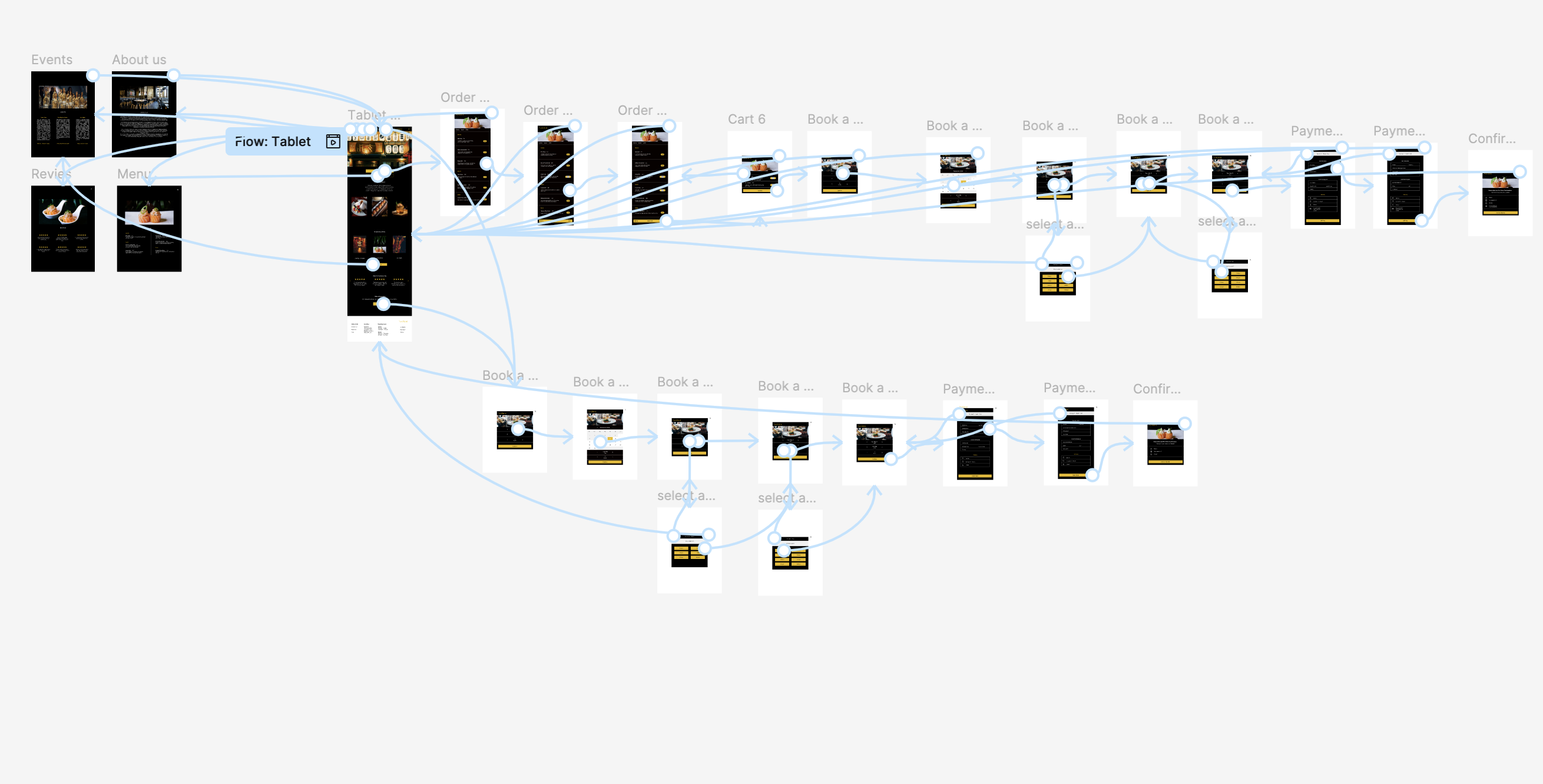
I kept the path simple and intuitive: the core journey a guest takes, from browsing the menu to a booked table and a pre-ordered meal.
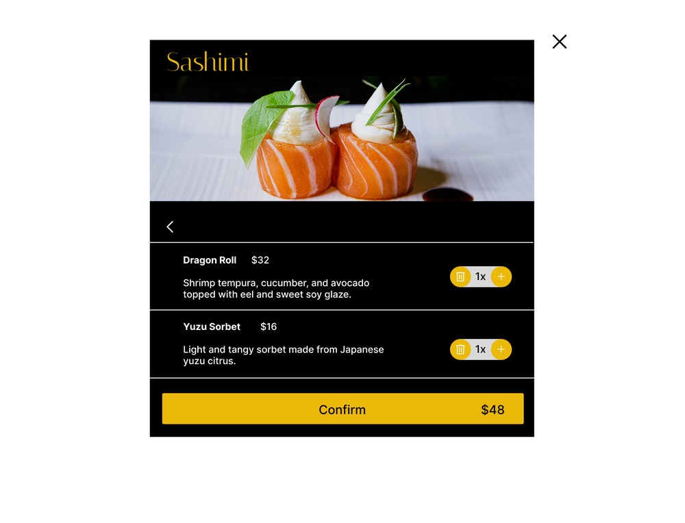
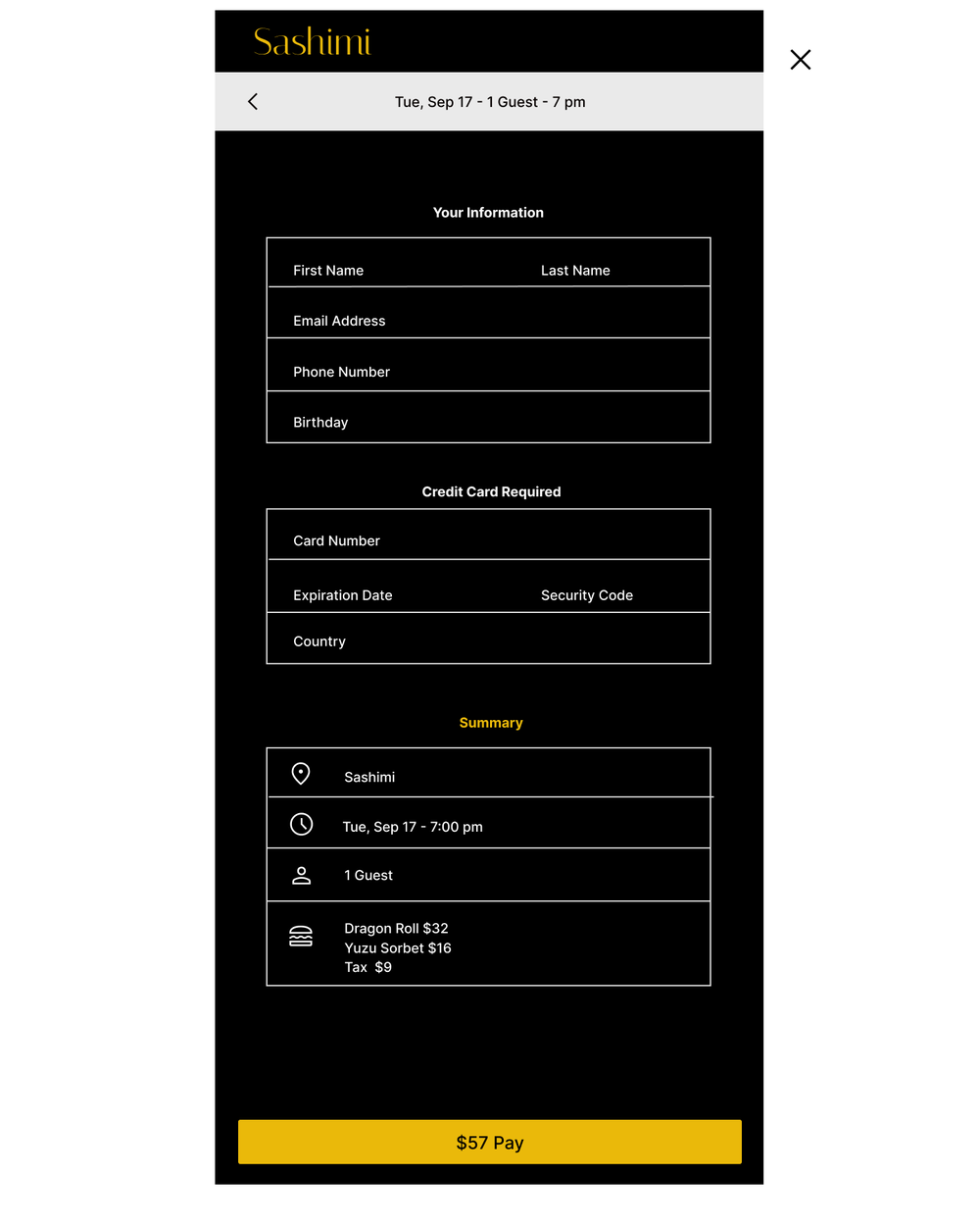
What I'd add next: a single review step just before payment that brings the reservation and the pre-ordered dishes together on one screen, so guests can check everything at a glance before they confirm and pay.
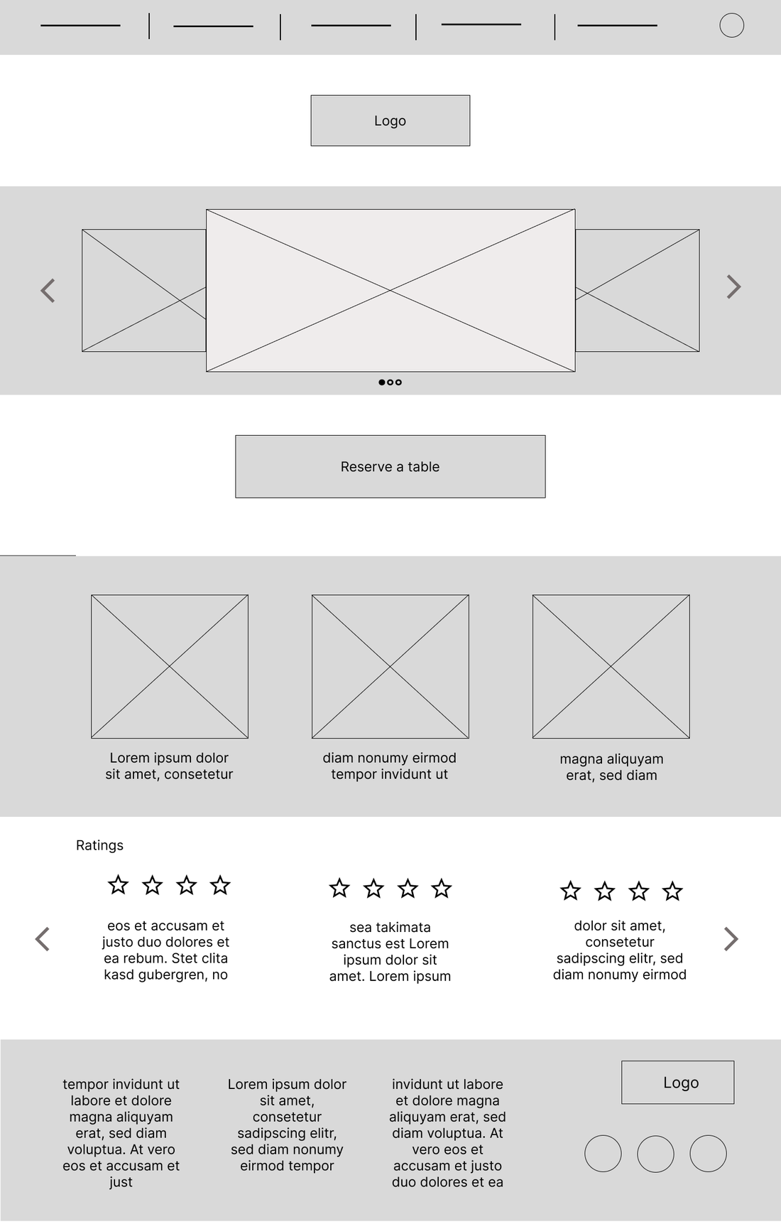
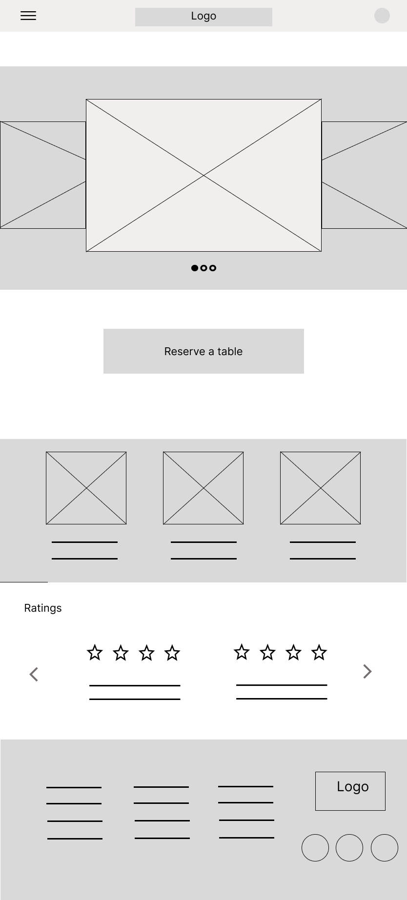
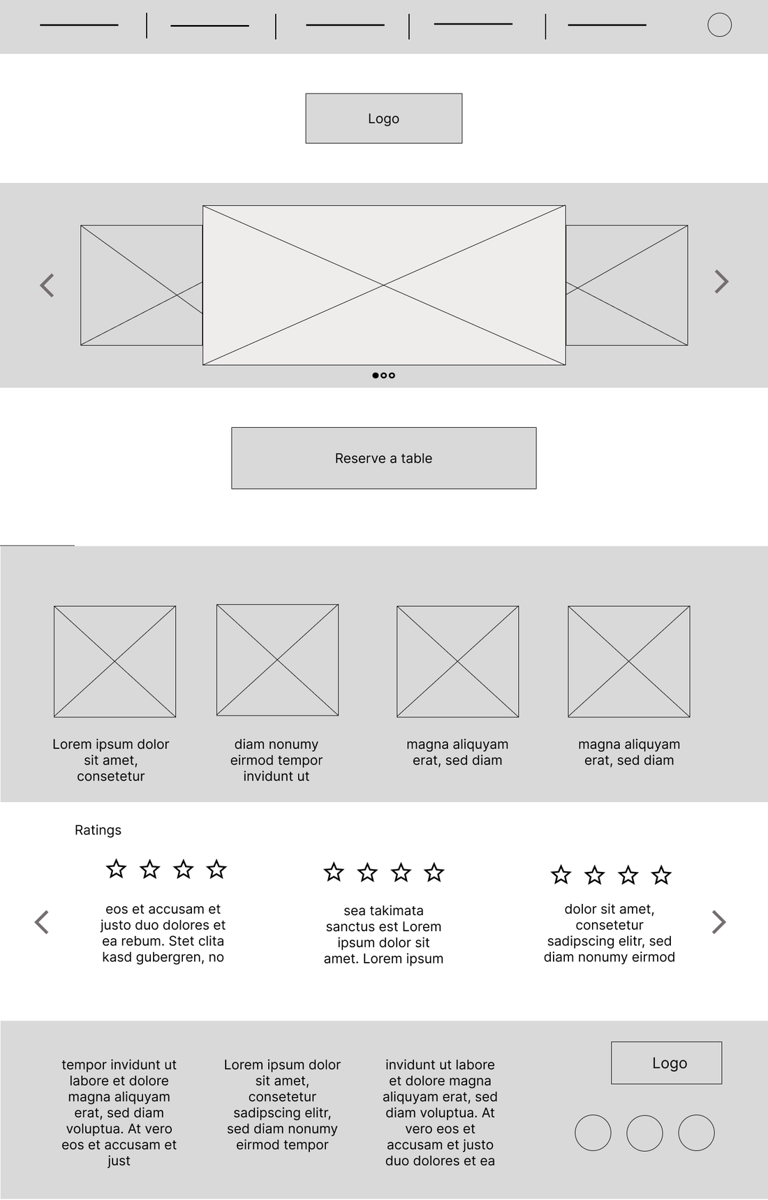
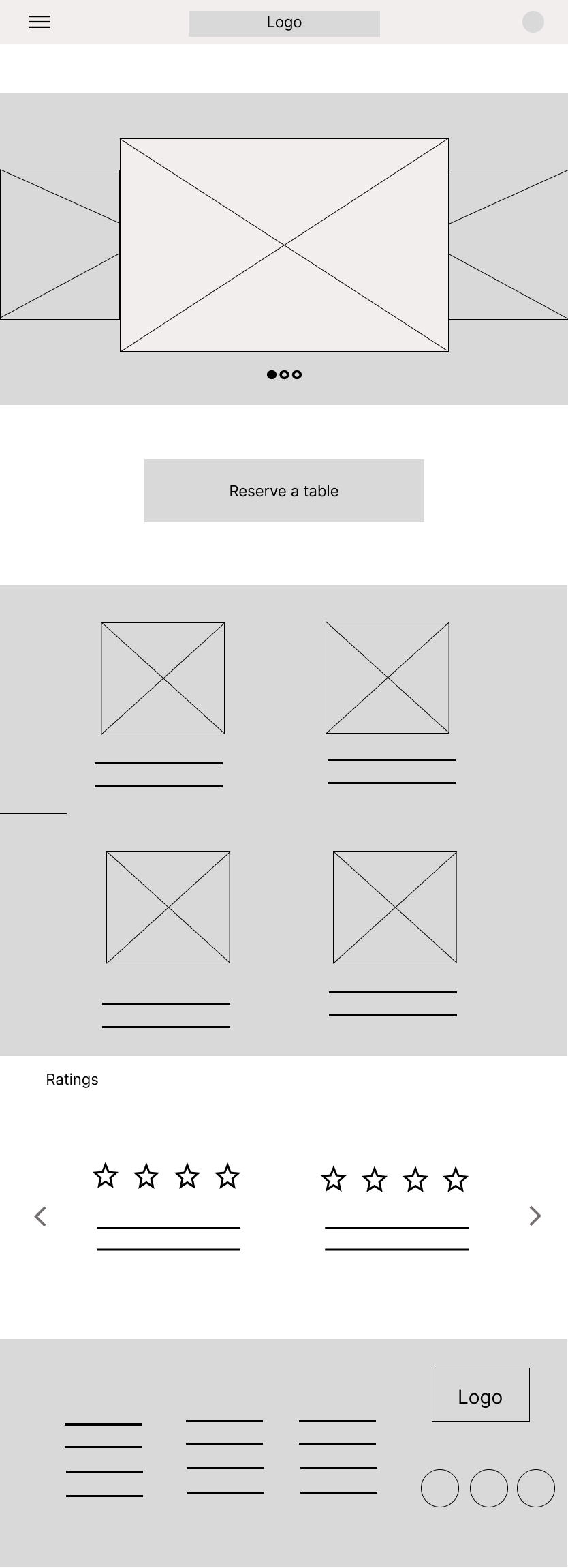
Before any visual styling, I laid out the same page at three breakpoints to get the hierarchy and the responsive behaviour right: what stacks, what hides, and what stays. Two iterations refined the layout across desktop, tablet and mobile.
The mobile design is fully clickable: a guided run through the core flow, from the homepage to ordering a meal ahead and then reserving a table. It opens straight in Figma, with no account or sign-in needed.
Open the interactive prototype →
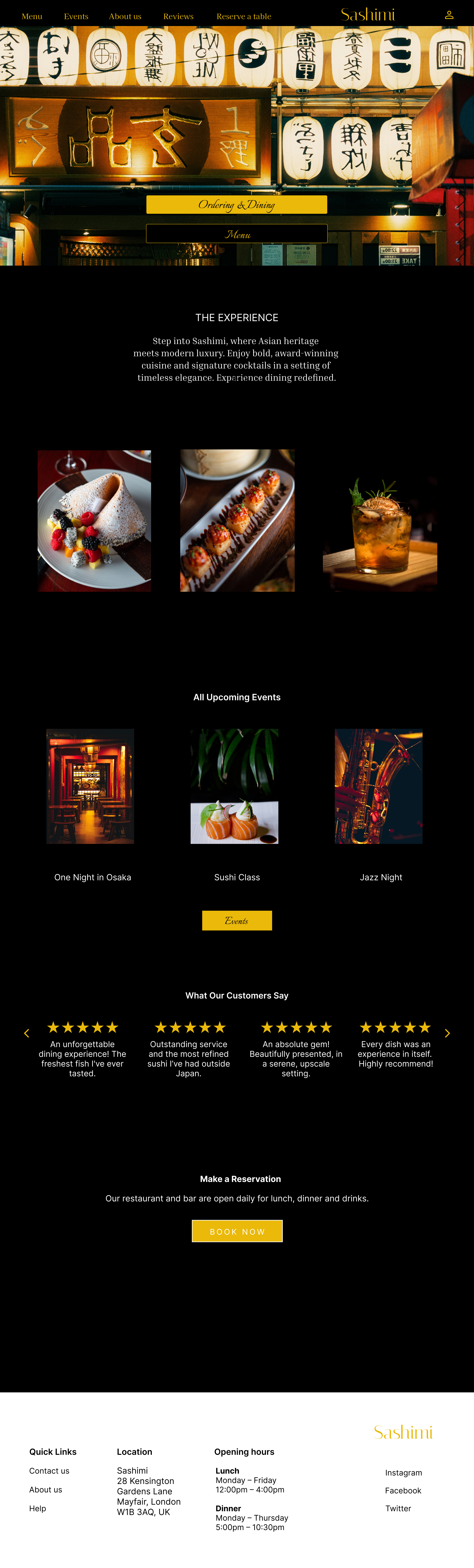
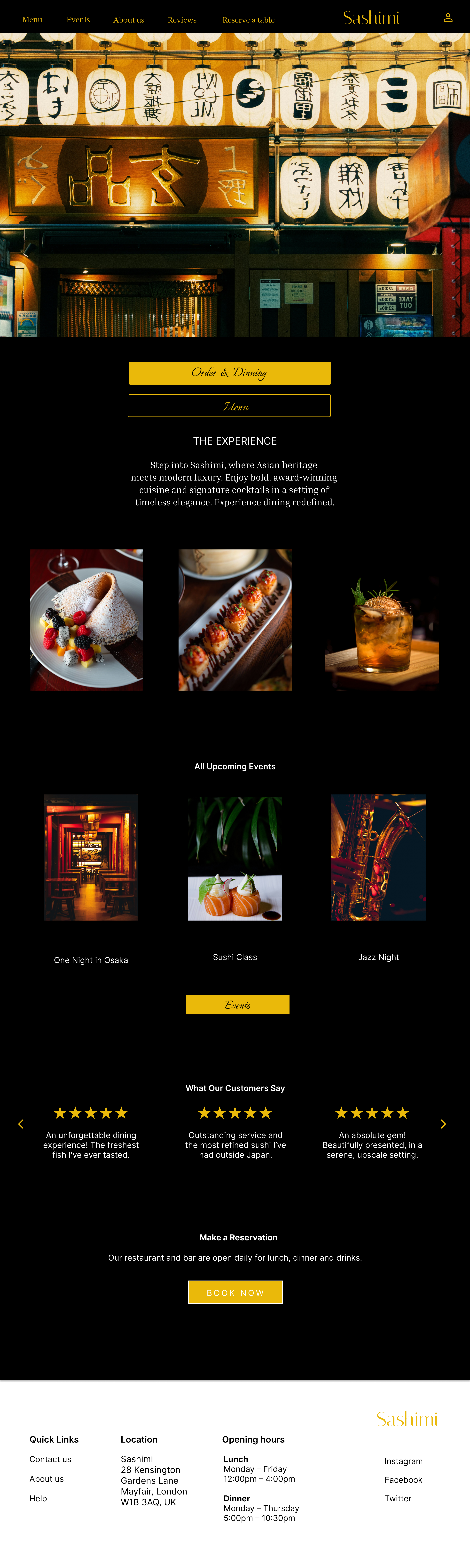
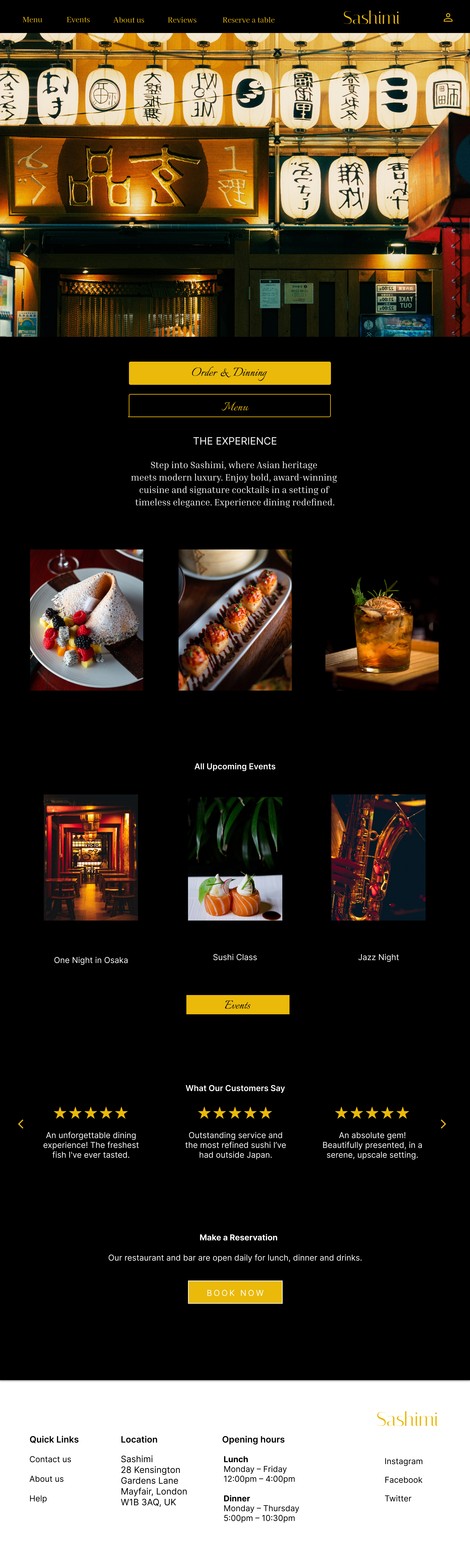
The main page in high fidelity, shown across desktop, tablet and mobile, with one visual language tuned to each screen.


For the design I chose a black background with golden accents that reflect Japanese culture. I kept the text and design elements to a minimum, so the interface stays clear, never distracts from the images and is easy to use.
The hero opens on a Japanese venue that picks up the same gold and brown tones and shows different Japanese script. Directly below it sit the two most important buttons, order and dining, alongside the menu. At the centre is the gallery, where images of the dishes guests can eat at Sashimi take the lead.
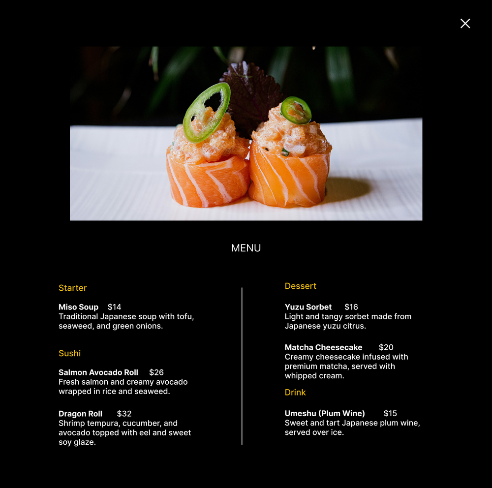
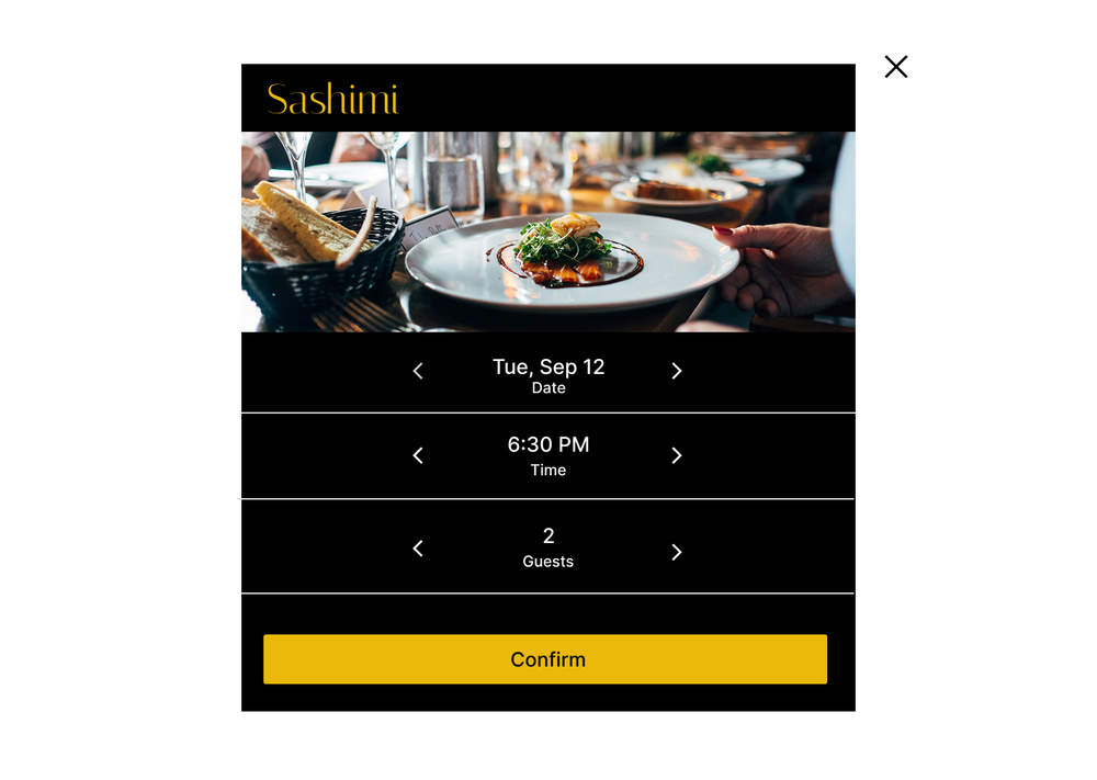
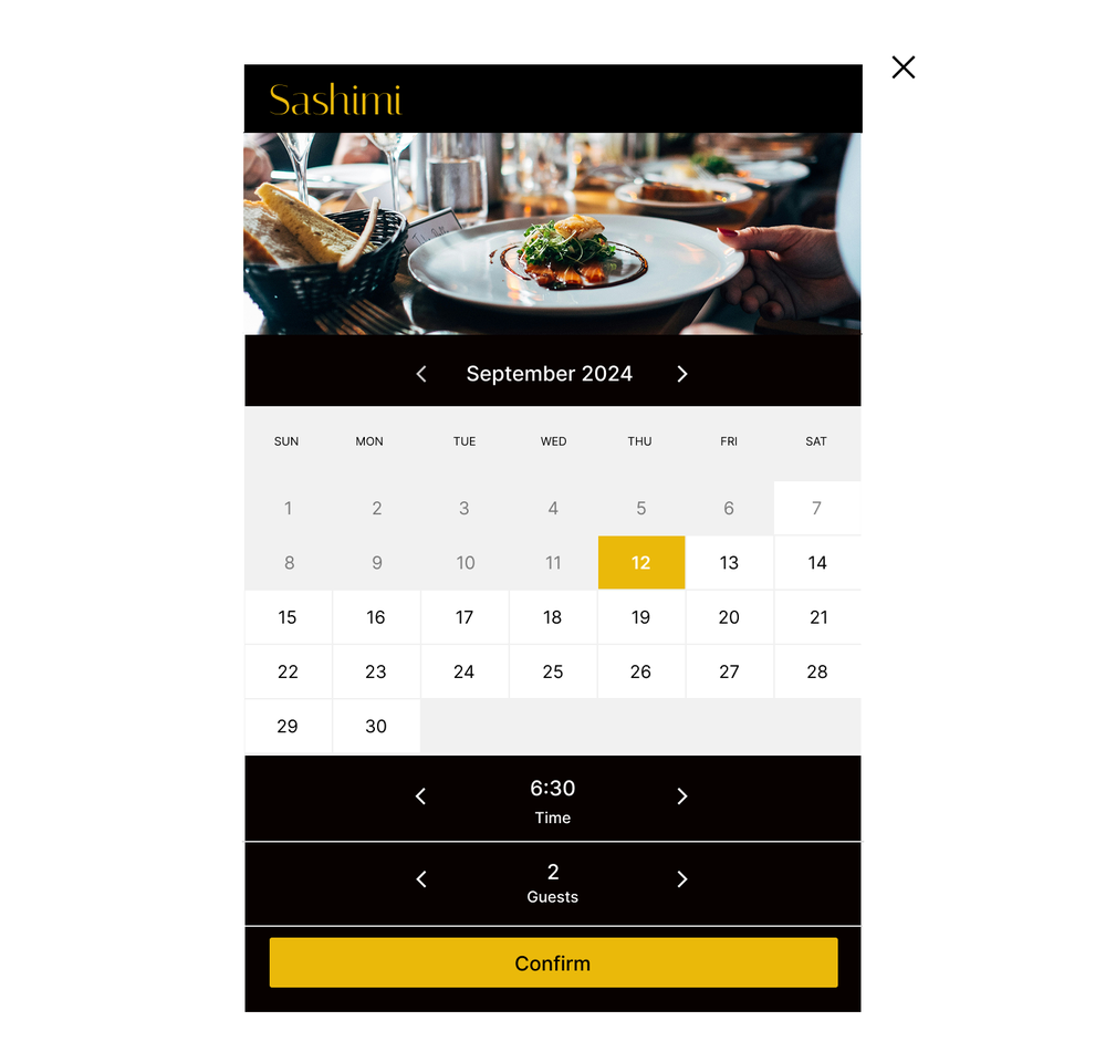
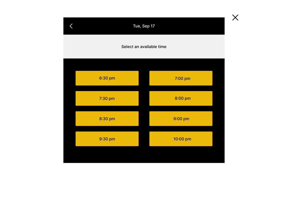
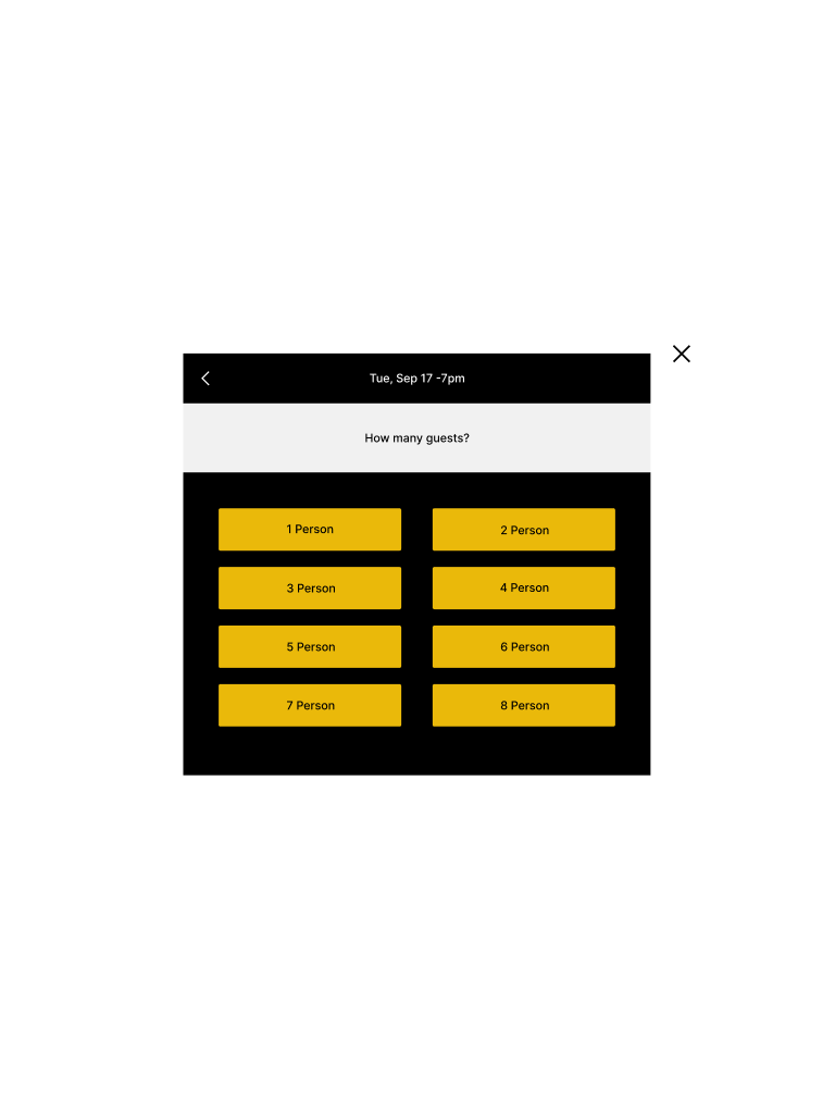
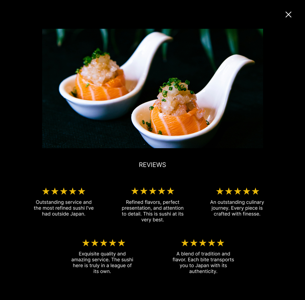
Around it, I wrote several articles about the events and the restaurant itself, so guests can learn more before they arrive, and just as important was capturing their voices through reviews. The menu I designed to feel classic and elegant, as if you were reading it at the table, and the main flow stays simple and intuitive, guiding guests step by step through booking and payment.
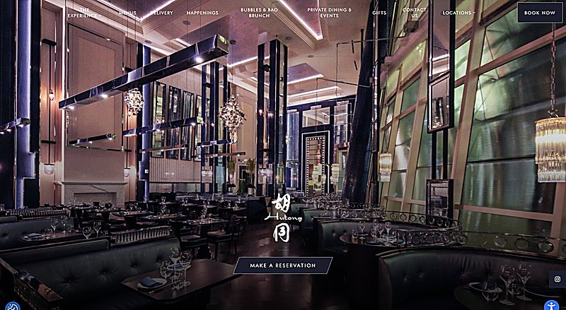
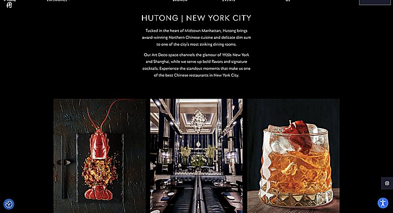
The direction came from New York's world of Asian fine dining, restaurants like Buddakan and 53, and above all from the website of Hutong, a Chinese luxury restaurant: an elegant, timeless, dark-themed interface, atmospheric and rich, carried by beautiful photography of the room. That reference is what convinced me to build Sashimi on the same dark, luminous foundation.

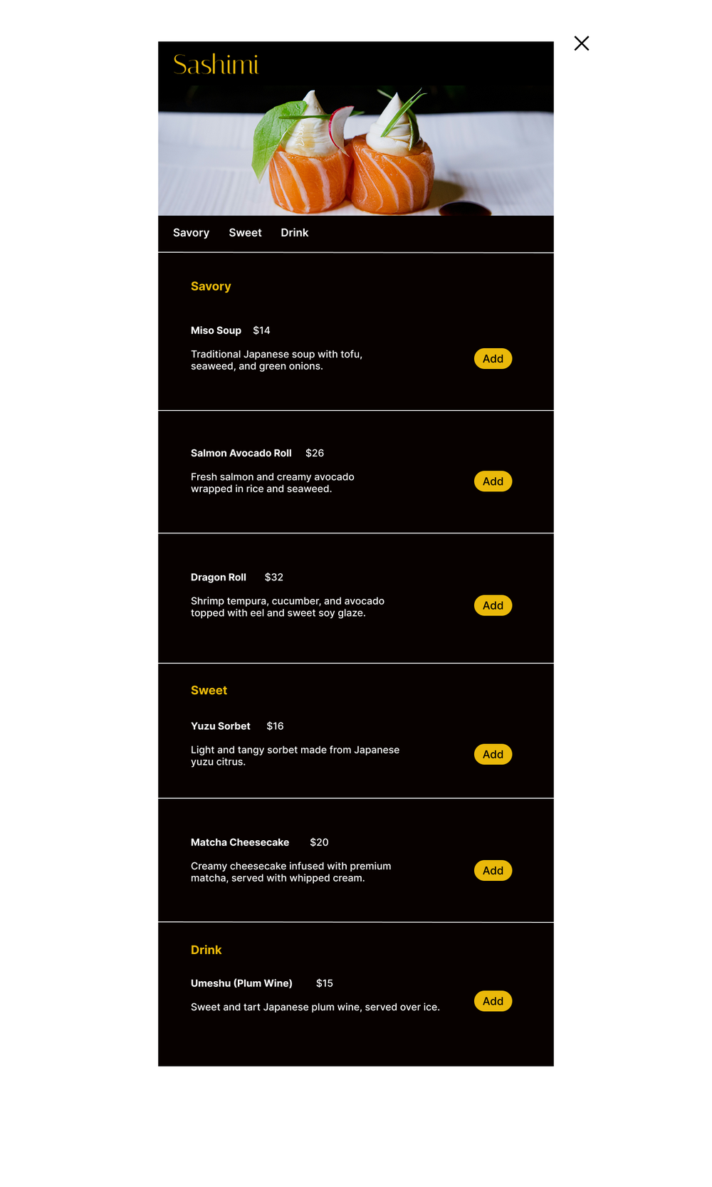
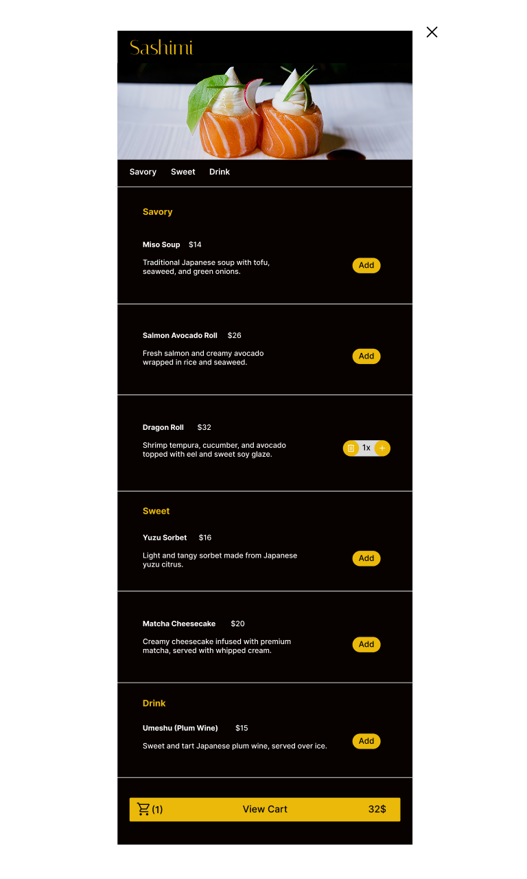
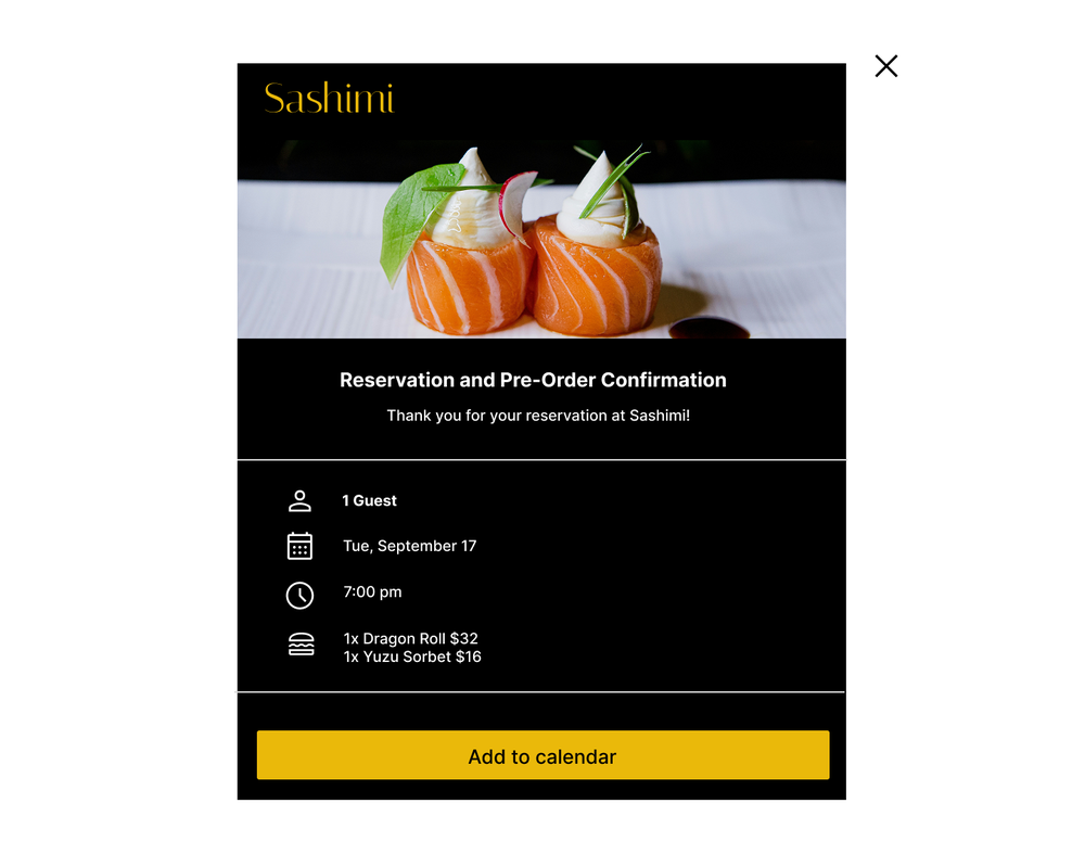
A closer look at the screens that carry the journey: discovery, ordering, booking and payment.


The result is a complete, responsive design for Sashimi: a calm, luxurious, high-end interface where guests can discover the restaurant, browse the menu, reserve a table and pre-order a meal. It moves from a blank canvas to a clickable, high-fidelity prototype, ready to hand to development.